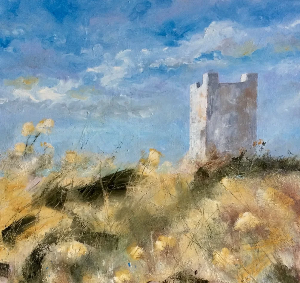
Navigational Tower, Isle of Whithorn.

Comments

Sometimes, the swine just WON'T come right, and the more you plough on with them the more dispiriting and depressing the fight becomes: you begin to doubt your ability to paint to much as a bottle of milk..... Put it away for a while, maybe, and look at it afresh? I can see a lot of room for development here, all the same - taking advantage of the light in the upper half of the painting to introduce a touch of marram grass or something similar (doesn't matter if it's really there or not!) - if in doubt in this sort of situation, I'll more often than not reach for the Burnt Sienna and a rigger brush: put in some curving verticals, glaze a bit, put something there that'll cast a useful shadow.

Forgot to add a little history of the tower. It’s a square tower and has been used for navigation for hundreds of years. In WW2it was used for anti-aircraft gunnery practice. You can see the Kirkcudbright coast, the Lake District and the Isle of Man on a clear day. There are a few bits and bobs on the roof of the tower, lights etc but I’ve omitted those.

You are absolutely right Robert, I feel negative about the whole thing now, and as you say my ability also! It won’t win…..I can assure you of that! Thank you Robert.

Well, I really like this Fiona so I’m now left thinking - what do I know? Of course I don’t know what you intended, own worst critics etc....

I don't fully understand the text below so suffice to say I like the picture!

What’s there is good Fiona , if you had posted it without your comments I would not have noticed. But once it’s in your head that it not right no amount of telling will make a difference. Don’t beat yourself so much and go back to it in a few weeks or so.

Leave ,leave,leave…..like just as it is.

Interesting history Fiona, I really like it. I find it difficult to judge my own work and I guess it must be the same for others sometimes. Your work is always top notch.

Keep the faith Fiona it all works well.

I think it's lovely. I love the castle and the sky and the textures. So no way beat yourself at all. You have lots of talent 😊

You are a lovely, helpful lot. I really appreciate your thoughts and advice, it’s interesting to hear your recommendations. Michael, funny you should mention cropping the bottom. I did originally but then thought, what was the point, I still don’t like it and wanted opinions about it. Many thanks everyone. I think you’re right, there is too much foreground, I wonder if it’s the dimensions of the canvas size? It’s square?

I like it Fiona. I particularly like the sky and tower. For what it's worth I think your a super artist. I love the amount of subtle variations in tones and colour that you get into so many of your works. I also love the softness you get into your paintings. I do like your honesty though. I think we all struggle with a picture from time to time trying to get it 'right' to our satisfaction. If I am struggling with a picture I sometimes try to squint with my eyes at it so that I just see the tones alone. That helps me to see if a section of it is throwing off the balance of the picture or not. I don't normally give an opinion but I just wonder if a relatively small adjustment to the dark green grass section in the top left foreground making it a little lighter and more like the green grass section on the top right would then re-balance the tones so that our eye is then re-focussed on the tower as the focal point? That's, of course, if you wanted the tower to be the focal point. I think the canvas size is fine. Either way it still looks great as it is anyway.

I love it the way it is.

There is such any airy feel about all of it . Put it away and look at again in a few weeks. Love the paintwork love the tower. Maybe a bit more contrast in the foreground, try a darker glaze on the right hand side where the shadows are?

Sky, light, tower, all great. Perhaps another “ layer” of darker grass bottom right with stalks/ blades here and there overlaying the present layer. However, there’s a lovely sense of sunlight …I love how you’ve done the tower. Don’t paint over it yet, look at it again in a week or so.

Interesting to read everyone's comments and to see the ongoing development

Fiona, I really like this - the colours are lovely, it has a fresh feel to it and the square format looks good. My only comment would be that the darkest black area near the centre is rather dominant and draws the eye - maybe tone it down a little?

Well...it looks very good to me, Fiona! It's as if we are climbing up the bank and suddenly see the tower looming up. Also, I always admire how you capture the movement of grasses etc. in the wind which you have here too!

It's only a bit of canvas, Fiona -Move on if you don't like. If it's any consolation to you I like it and you are the world's best 'Grasser'.

I know how you feel, Fiona. Sometimes whatever you do just seems to make matters worse. However, I like the foreground with its various marks.

I always enjoy your somewhat, wild, landscapes which have a sense of abandonment Fiona. This one feels so naturally wild and as Anne mentioned, a steep incline challenging the approach to the tower seems apparent. I’m sure you’ll find a way to make the changes you feel satisfied with but if its any consolation I think this has a lot of simple charm, movement and appeal.

Thank you all very much for your valued advice and observations. I’m very grateful for the time you’ve taken looking and mentioning possible solutions, one of the many things I love about this site….help is never far away! I am going to put it in the naughty corner for awhile…..if there is room for yet another…..then take another look when I’m not so frustrated with it. Thanks again for your kind words x

Lovely place Isle of Whithorn. Am not a "technical" ( is that the right word) art person but I do like the way you paint grasses etc.

Love the light in this hitting the side of the tower and the way you have described the grasses, a very impressive painting Fiona. Good to see you using other forms of medium to express yourself, go for it!🥰

Thank you very much Richard and William, very kind of you to help me out with your encouraging feedback.

As others have said, it’s hard to advise without being able to see your vision of how you wanted it to turn out. I like it very much, I’d be proud to have created it, I’d be delighted if it was hanging on my wall. But you know, we all have times when we can’t create the image we want to and have a crisis of confidence - I’ve just ripped up a portrait that I had done from a photo & liked the way it turned out, and everyone else who saw it liked - except the subject, and that was the important one.

Jacqueline, thank you very much for your thoughts…..very true in what you say about the end result. It must be even more difficult and disappointing with regard to a portrait. Generally it just makes me curse a lot before I move on, because I know I’ve lost the spark of why I wanted to paint it in the first place.

Great textures, Fiona!

Thanks Cesare!

A lovely sky. By its nature the tower is not particularly interesting, but you solved that with textures Fiona. I also like the scratchy feel of the fine grasses, and I can almost hear the crickets. Nice work.

Thank you very much John for your kind words and encouragement, much appreciated.

Looks fine to me, we are our own worst critics. I love the texture you have achieved in the foreground even if it was not what you had intended. The phrase less is more comes to mind.

Well, I like it. Square is often a difficult format to bring off, but the foreground does lead in to the tower. I suspect the foreground is either too abstract or not abstract enough - if you're convinced you've nothing to lose, try something experimental in the lower half...

Rachel, Matthew, thank you both very much for your encouraging feedback. I’ve put it to one side for the moment and will have another look….I have a feeling nothing will come of it in the end! Lol

I really like this - soft but effective use of colour Fiona.

Appreciate your comment Shaun, thank you.

Hang on Studio Wall
31/07/2021
2 likes
570 views

16”x16” oil on canvas. I’ve been at this on and off for what seems like months. I’ve had enough of it now, the foreground just wouldn’t work no matter what I did. I’m happy-ish with the sky and tower but not how the foreground turned out. This is the third attempt! I’ll let it dry and paint something wild over it, just to show it whose boss…lol.

About the Artist
Fiona Phipps

View full profile
More by Fiona Phipps