


Water is the most challenging and difficult of subjects for the artist to express. Its surface responds to the slightest air current, the movement of tide, and every change of light. Its moods can be tranquil or thunderous.
Moving water has a complexity of form and many aspects. The gushing spiral of water from a kitchen tap is just as difficult to express as a misty cloud of sea spray.
Water is often colourless in itself, but influenced by surface coloration from the sky and local objects, such as trees and buildings. Suspended matter in the water also contributes to its apparent colour.
Water can be liquid, solid or vapour, and is one of the commonest substances on earth. Clouds consist mainly of water and contribute to the atmosphere of landscape.
Our subjects are not confined to the sea, rivers or lakes. There is magic in the effect of light in a glass of water, a cart track grey with winter's ice, the reflection of sky in a bucket or cattle trough. By becoming aware of hidden beauty an artist can extend his scope of subject and range of expression.
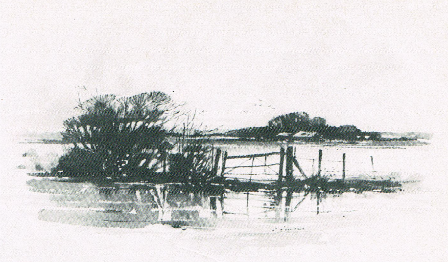
Flooded Field, writing ink on watercolour paper, (2.5x7.5in.)
One of my favourite subjects which has water in its theme is a flooded field. For this sketch I have used a brush and writing ink on watercolour paper. It is a direct drawing without the use of white paint. The reflections are crisp and clear to suggest a smooth surface of water.
A painting with an aspect of water has a particular appeal and interest. Too often we see it poorly depicted, yet it is an essential element of a landscape painter's curriculum.
For drawing the many forms of water, I consider that charcoal is unbeatable. It is a beautiful and expressive medium capable of a rapid range of broad tone, or sensitive line. The pitfall of charcoal is that it does flatter weak drawing. To strengthen drawing ability it is best to alternate with pencil and pen.
For some of my studies I use charcoal and white soft chalk pastel on medium grey or dull blue sugar paper. Cartridge and pastel paper are also used for studies and more finished work. It is essential to carry a can of aerosol charcoal fixative when working outdoors, because charcoal and soft chalk pastel smudge very easily.
Most of my pencil drawings are done with a soft carbon pencil or 6B graphite pencil. It is well to understand the expressive qualities of pencils and papers - it helps to build confidence in your drawing.
First efforts at drawing water will be tentative and probably disappointing it takes a lot of practice and observation to produce something worthwhile.
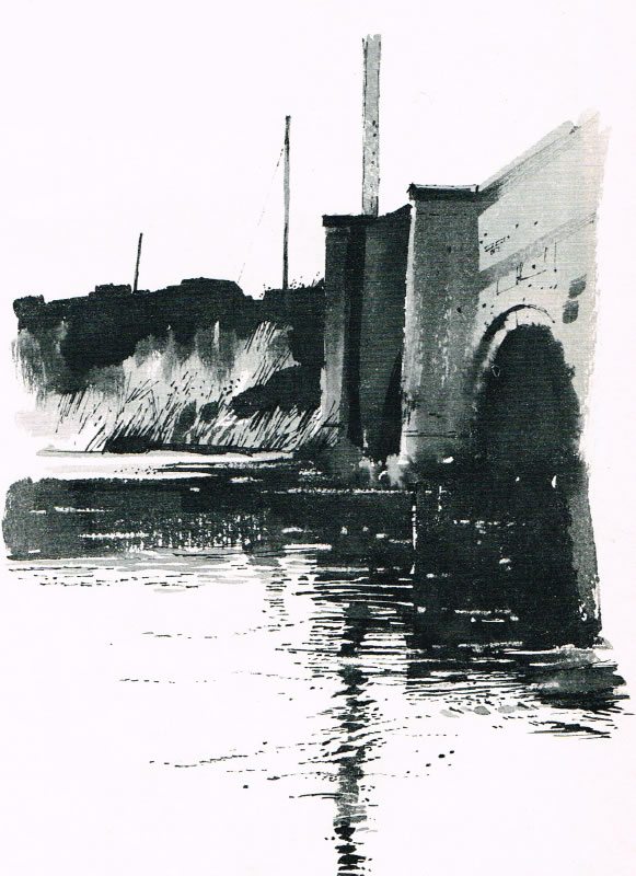
Bridge, Dorset, writing ink on watercolour paper.
In this article I have mentioned that water is generally darker than the sky, but here I have retained the white paper to suggest an effect of light on moving water. The reflections are fragmented into interesting patterns by ripples on the moving tide.
Moving water
The first consideration is to select a small area of your subject. The next step is to determine the character of its movement. If you get this right your drawing will have a sense of action.
With all forms of moving water, how ever complex it may appear, the important thing is to determine its form. A trickle is totally different in shape to gushing water. This can best be demonstrated by turning on the kitchen tap gradually and then to full force
For my preliminary studies of moving water I set up a garden hose over a large shallow bowl and made many drawings of the fall of water. All the sketches were done sitting close up to the arc of water from the hose, so that I could closely observe the effect of splashes and bubbles.
The most important thing to remember when drawing and painting water, is the necessity to eliminate unnecessary detail, and yet retain the essential elements of the subject. This is particularly applicable to moving water when it has many complex forms.
A camera is a very useful aid for studying movement. It reveals intricacies hidden from our eye, strengthens observation and understanding. But it should not take the place of drawing and personal observation.

Goldfish and Lily Pads, pastel on canvas, (18x18in.)
For my subject I selected a very small area of a fountain pond. The splash of water creates an interesting contrast of texture, and light and shade. The composition is an interesting balance of movement. To counteract the ripples moving out of the top of the picture the lily pads and goldfish are placed towards the opposite corner.
Calm water
A stretch of calm water has an aspect of tranquility that man y artists seek to portray in their paintings. Many make the mistake of thinking that because water lies flat and horizontal that is the way brush marks should be. If this is exaggerated it has the effect of rushing off either side of the painting. Varying brush marks, angles and widths add interest and animation.
An enclosed area of calm water can be found in various environments and offers plenty of scope to the observant artist. Calm water is not necessarily absolutely still. Its surface may be affected by tide, current or the wind.
Perfectly still water reflects everything above its surface accurately and clearly. This presents the problem of deciding how important the reflections should be. The surface of water is generally darker than the sky and this tone value must be judged very carefully to achieve the right balance between sky and water. Make sure reflections don’t fall out of the bottom of the picture. A darker graduated tone across the lower part will obviate this.
Reflections
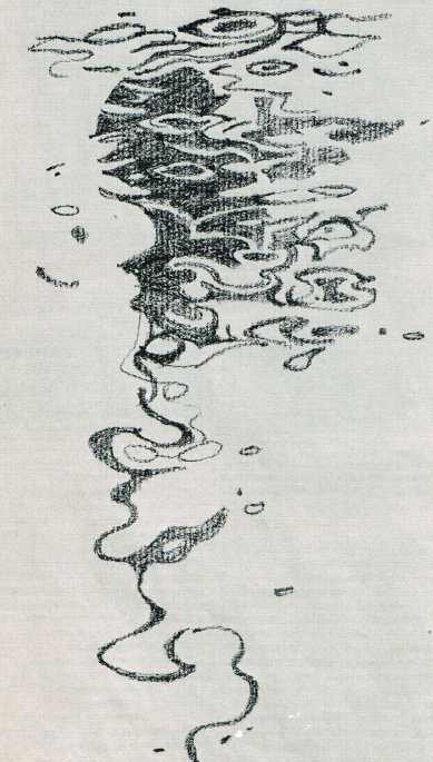
Abstract, carbon pencil on paper, (7.5x4.5in.)
My pencil drawing is an accurate study of a reflection of the bow of a boat and its mast. As I have mentioned in this article, movement of water surface elongates and distorts a reflection, and this is a good example. My main concern here is the pattern of dark and white shapes.
As a reflection becomes disturbed by ripples or swells, it becomes elongated and distorted to form fascinating abstract patterns (see above). A close study of these patterns opens up a rich source of design material.
If the object reflected is totally ignored you will stop thinking about actually drawing the reflection of a mast or whatever, and be more able to appreciate its design and abstract value. So when you draw or paint reflections try isolating them completely from the object.
The camera will freeze the pattern of moving reflections and enable you to study more easily intricate shapes, patterns, tone and colour. You should however supplement photographs with drawing and painting on site.
Reflections are often very powerful shapes and can quite easily dominate a painting to the detriment of the overall effect. If you are including reflections as a harmonious part of your subject turn the painting upside down. You will quickly discover if you have this or not. Any discordant shape, tone or colour will stand out.
Your outdoor studies can be in any medium you choose, but to begin with I suggest you choose a charcoal stick or soft pencil. They are ideally suited for quick tone or line drawing.
Light
One of the most difficult aspects of painting water, particularly the sea, is to capture the effect of light on its surface.
Light creates mood and atmosphere and, apart from adding interest, it also adds life to a painting. To help you understand this better, observe t h e effect of light on wet pavements, the glint of shiny objects, the way dull surfaces absorb light, the effect of light on crumpled metallic foil.
When I am painting an aspect of water outdoors I become acutely aware of the different effects of fluctuating light across its surface. Sometimes it is dull and devoid of any life, but a streak of light transforms it and lifts the painting from the doldrums.
Studying the effect of light should be the primary occupation of every landscape artist.
If you become dispirited and daunted by such a difficult task as painting and drawing water remember these words of Claude Monet:
'I have started again to paint the impossible: water, with waving grass in the foreground. It is wonderful to look at, but it drives me mad to try to paint it. However, those are the sort of things I go for.'
This feature by Norman Battershill is taken from the October 1984 issue of Leisure Painter

The front cover features a detail from one of the illustrations in Norman Battershill's book
'Painting and Drawing Water'
which was published in 1984 by Adam and Charles Black
Comments
Login or register to add a comment