



Discover the basics of pigment and binder ratios in pastels. This beginner’s guide explains how composition affects colour, texture, and the overall quality of your pastel artwork.
Understanding the composition of pastels is key for beginners who want to create vibrant, smooth, and long-lasting artwork. Pigment and binder ratios affect how your pastels feel, blend, and appear on paper. This guide will help you learn the basics so you can make better choices when selecting and using pastels.
This essential guide will cover:
What are pigments and binders?
High pigment-to-binder ratio (soft pastels)
Lower pigment-to-binder ratio (hard pastels and pastel pencils)
Oil pastels and pigment-to-binder ratio
Pan pastels and pigment-to-binder ratios
Essential tips for beginners...
What are pigments and binders in pastels?
Pigments are the substances that give pastels their color. They determine the intensity and vibrancy of your artwork.
Binders are the materials that hold the pigment together, such as gum arabic, chalk, or wax, depending on the type of pastel. The balance between pigment and binder directly influences the pastel’s texture, ease of blending, and how it adheres to the paper.
What is the pigment-to-binder ratio in pastels?
The ratio of pigment to binder is a key factor that defines the type of pastel and how it behaves on paper. A higher pigment-to-binder ratio results in more vivid colours but less structural strength, while a lower ratio results in a harder pastel with less intense colour.

High pigment-to-binder ratio (soft pastels)
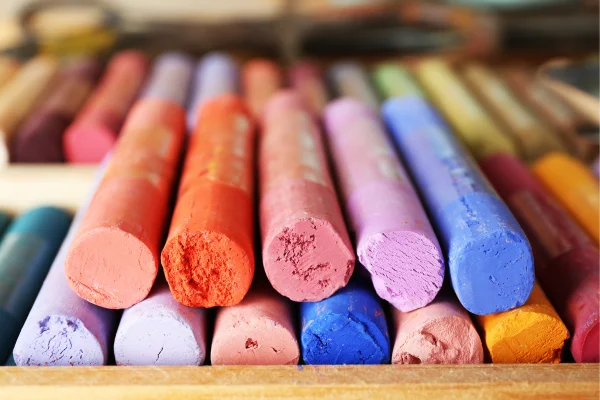
Soft pastels typically have a high pigment-to-binder ratio. This results in intense, bright colours because the pastel contains more pigment and less binder. The reduced amount of binder makes these pastels softer and more prone to crumbling.
Example brands: Sennelier, Unison, and Rembrandt (soft line).
Lower pigment-to-binder ratio (hard pastels and pastel pencils)
Hard pastels and pastel pencils have more binder mixed in, which gives them a firmer texture and more durability. The colour payoff is less vibrant compared to soft pastels due to the lower concentration of pigment.
Example brands: Faber-Castell Polychromos, Prismacolor NuPastel, Stabilo Carbothello pencils.
Oil pastels and pigment-to-binder ratio
Oil pastels have a unique binder made of non-drying oil and wax, which gives them a creamy, smooth texture. The pigment-to-binder ratio can vary, but many oil pastels are balanced for intense colours with good workability.
Example brands: Sennelier oil pastels, Cray-Pas Specialist.
Pan pastels and pigment-to-binder ratios
Pan pastels contain a very high pigment-to-binder ratio, similar to soft pastels but in a compressed powder form that reduces dust. They offer vivid colours and smooth application when used with sponges or applicators.
Example brands: Pan Pastel
Why does the pigment-to-binder ratio in pastels matter?
Colour Intensity: A higher pigment ratio gives you brighter, more saturated colours, while a higher binder content results in softer, more muted tones.
Texture and Application: High-pigment pastels (e.g., soft pastels) glide smoothly across the paper and are easy to blend, while low-pigment pastels (e.g., hard pastels) provide more control and precision.
Durability: More binder creates a harder pastel that resists breaking and smudging, ideal for detailed work and layering on top of softer pastels.
If you're new to pastels, don't stop here! Explore our other beginner-friendly guides to learn all you need to progress and develop your pastel skills.
Essential pastel tips for beginners...
Choosing the right ratio for your needs:
For beginners: Start with medium-soft pastels that have a balanced pigment-to-binder ratio, such as Rembrandt or Faber-Castell. These offer vibrant colour without being overly delicate.
For detail work: Use hard pastels or pastel pencils with a lower pigment ratio for added precision.
For vibrant artworks: Select soft pastels or Pan pastels with a high pigment ratio to achieve brilliant colour and soft blending.
Understanding pigment and binder ratios in pastels is essential for creating beautiful, lasting artwork. By learning how composition affects colour, texture, and blending, beginners can make informed choices and improve their pastel techniques. Experiment, observe, and enjoy the process of discovering how your pastels work best.
If you’re new to pastel art, don’t stop here! Explore our other beginner-friendly guides to learn about choosing the right pastels, blending techniques, framing your artwork, and keeping your creations safe. Each article is packed with tips to help you improve your skills and enjoy your pastel journey
- Beginner’s guide to pastels: Exploring different types and how to choose them
- Beginner’s guide to pastel paper: Types, textures and how to choose the right one
- Beginner’s guide to mastering key techniques in pastel art: Tips for stunning results
-
Beginner’s guide to blending pastels: Easy techniques for smooth and vibrant artwork
- Beginner’s guide to correcting mistakes in pastel art: Tips and techniques
- Beginner’s guide to organizing your pastels: Tips for easy storage and access
- Pastel safety for beginners: Essential tips for safe and healthy art practices
- Beginner’s guide to using fixatives with pastels: Protect and preserve your artwork
- Pastel art and mindfulness for beginners: Relax, create, and reduce stress
- Beginner’s guide to framing pastel artwork: Tips to protect and display your pastel art

Comments
Login or register to add a comment
No comments