


This is a Studio member-only feature!
Join our Studio membership and save your favourite Painters Online content, from gallery artwork to step-by-step guides, to your own online mood boards. Create your go-to place for inspiration and learning. Plus, members can also enjoy a range of exciting features including monthly art videos and a digital magazine library.
If you are already a Studio member, simply login to your account.
Not a Studio member? Why not try our free 30-day trial - no commitment, no credit card required
Posted on
Latest News


Latest Blog Entries


Latest Reviews


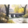
Paul Talbot-Greaves acrylic exercises in The Artist - part four
Read Paul's critique of Pauline Stephenson's version of his In The Shade exercise from the April issue of The Artist.

The fourth of the acrylic exercises set by Paul Talbot-Greaves in the April issue of The Artist was to depict light and shade.
From the paintings (all of which can be seen here) Paul selected Pauline Stephenson's version (see below) for appraisal this month, saying: 'Once again a grateful thank you is extended to everyone who took part in the latest challenge of ’In the shade’. One or two people here have been caught out by too much saturated colour in the shadows, so my appraisal this month will hopefully recap and emphasise the importance of mixing those shades.'
Paul's appraisal
Great start here Pauline because you have those bright sunlit colours just right but if I can, I’m going to try to guide you with your shadow colours. Colours in shadow are generally stronger and less colourful than those in the light. For that reason it is important to ‘grey’ your colours. That doesn’t mean you can’t enjoy using colour because most shadows aren’t just grey, they are greyed colours. In your shadows you have some of this on the grass, probably as a result of using violet and crimson, which are opposites to the green and therefore they have ‘greyed’ it. Your trees look great but just lack the shading to make them back lit. Notice too how your wall jumps out? This is because it is the brightest most dazzling part of the painting. Underpainting with white has made it bright when it should be shaded to tie in with the tree and land shadow.
If you find mixing opposites to make shades confusing then here is a simple method that you can use. Whatever colour is in the shade you take that colour and add some ivory black. All you have to do is make sure you can still make out the identity of your original colour, for example with your green you should aim for a green-grey not just grey. You can also warm or cool the shadow by adding some burnt sienna or cerulean blue. By all means use colours of your choice and the lovely texture techniques that you have employed but shade the colours down where necessary and this will give your work much more impact. To help illustrate my point I have electronically shaded some of your colours (see below) – I hope you don’t mind?

Look out for the last of Paul's exercises in the June issue (published 22 April) and send in your versions to [email protected] for inclusion in the gallery and the chance of a critique from Paul.
Latest News
Latest Blog Entries
Latest Reviews
Comments
Login or register to add a comment
No comments