

Bonus Features September 2019
Bonus Features from talented PaintersOnline Gallery Artists
Kevin Williams Robert Buttle Sarah Jennings Sarah Stanley
Becoming a professional artist by Kevin Williams
Whilst I have been an artist, of sorts, for many years I have only recently found my passion centre stage, or rather, centre page, in my life.
My background
Let me explain! Having graduated in the mid 1980’s as a graphic designer/photographer, I spent much of my life working I those fields. Later I moved into the print industry and managed an in-house print facility for a local authority for a number of years. This was all very interesting and I was dedicated to my career. However, a passion within me kept igniting and periodically I would return to my first love, painting and drawing.
Painting and drawing are the most satisfying things I do and I have piles of sketch pads full of the doodlings and noodlings of a serial sketcher.

I really do love pencil and paper and I am never happier than when I am drawing.
Occasionally, over the years I have embarked on short bouts of painting. Usually portraits and landscapes in oil or watercolour. It has been something I have been respected for by my family and friends and occasionally I have brought this work into my professional life earning fees for book cover illustrations and other commercial document production commissions.
The thing is: I didn’t, until recently, believe that drawing and painting was a serious pursuit which I could call my career.
In 2017 I decided that life was too short not to pursue my passion and decided to begin a life as a full time painter.
And this is what I did:
Book covers
In 2017 I was a freelance marketing consultant and graphic designer moving from commission to commission producing marketing strategies and marketing collateral for clients. I took a couple of commissions for book cover illustrations and produced work which, heavily vetted by the publisher and author, I wasn’t entirely satisfied with. Whilst I was happy to be painting and drawing I began to crave the freedom to produce pictures which were my own expression.
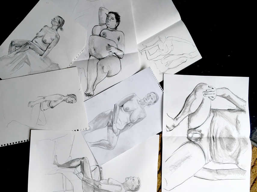
Joined an art group
I joined the Wolverhampton Society of artists and began attending their regular life drawing classes (see above). This fired me up and challenged me to improve my drawing skills. Mixing with artists and spending more and more time with pencil and brush in hand I began to take my art more seriously.
Approached a gallery
I produced some watercolours (examples below) which were accepted in two art shows early in 2018 at the Lighthouse Gallery, Wolverhampton.


Competitions
In the summer of 2018 I entered the Newhampton Art Centre ‘Paint the Day’ competition which challenges local artists to spend one day painting something within a square mile of Wolverhampton City Centre. I won the competition and with a prize of £350 and the sale of my picture I was overjoyed to have earned recognition and some actual cash for my effort. This felt like it may be the start of something for me.

The next step

Taffs Well and Gwaelod-YGarth from the Graig Yr Allt, oil on canvas
So, whilst walking the hills around my home village of Taffs Well (see above) in South Wales in the autumn of 2018 the light bulb in my head began to flicker. I walked and thought and by the time I came down off the hills a plan had hatched.
I decided to produce an exhibition of paintings the subject of which would be my own village and it’s surroundings. I would seek a venue in the community to host the exhibition and I would invite the whole community to come to the show. Hopefully I might sell a few pictures and kick start my new career as a full time, professional artist.
So, I talked to locals about my idea. Researched local history and begun painting and drawing local scenes. I approached a local publican and was very happy when the landlord and landlady of Fagins Ale and Chophouse agreed to host an exhibition for two weeks in April 2019. Now all I had to do was produce and frame around 40 paintings.

Afternoon Sun, Village Centre, oil on board
The making of an exhibition
I began exploring the village and painting pictures in October 2018 in preparation for an exhibition.
Process of a painting


The River Taff and the Garth, oil on board


The A470 running through the village and alongside the Forgemasters, oil on canvas
I found myself working long hours and the pictures started to take shape. Before I knew it I could feel the exhibition beginning to feel real. I thought about my ‘style’ and what medium I should use. I couldn’t make up my mind so I decided not to get bogged down with trying to produce a signature style but simply to produce the work and see where it led me.
Change of medium
Working largely in oils for the initial stages of the project I decided to switch to watercolours for some of the subjects.

Water for the Dead - a Hut at the Local Cemetery, watercolour on paper

The Other Side of the Tracks, watercolour on paper
I also worked with graphite sticks on paper for some of the more forestry related subjects..

Curly Tree, graphite stick on paper

Coed Y Bedw Woodland, graphite stick on paper
So, month by month I worked away and by February 2019 I had produced over 30 paintings/drawings.
Sometimes I worked en plein air and other times I worked in my studio from photographs taken whilst exploring. The whole process became an obsession. As time went by people in the community became aware of my presence. The exhibition was being talked about. I started to publish some of the images onto the local social media networks. The whole thing was gathering momentum and seemed more and more worthwhile as time passed.
Working with schools
The next important thing I did was to engage with the two local primary schools in the area. I approached the head teachers and invited the children to participate in my exhibition. I spent a full day in each school working with the kids on their pictures. I found this very rewarding and I believe the children enjoyed the process too. Ultimately I would exhibit around 200 of the childrens’ pictures (see below) alongside my work in the exhibition. The involvement of the community in my exhibition was becoming ever more important to me.
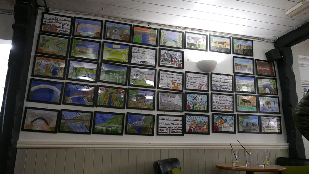
Children from Taffs Well and Gwaelod-Y-Garth Primary schools participated in my exhibition
Local landmarks and history
The village of Taffs Well is on the east bank of the river Taff, six miles north of Cardiff. Just across the river on the west bank is another village called Gwaelod -Y-Garth. The two villages are separated by the river but joined by two footbridges. The oldest and best loved footpath which joins the two villages runs over the northern most footbridge from Taffs Well and then comes to a steep incline at the foot of the Garth mountain with a rise of about a hundred feet to the main road through the village of Gwaelod-Y-Garth. This footpath is affectionately known locally as ‘The Zigzag’. It is a mean and unforgiving climb but unless you have the time to walk about a mile via the south footbridge this is the route of choice for those who have the stamina. I painted the footpath.

The Zigzag, oil on canvas
Another local landmark of great substance and beauty is the Garth mountain. The same mountain that is the subject of the Hollywood movie, ‘The Englishman who went up a hill and came down a mountain’, by Taffs Well writer, artist and film maker Christopher Monger. The mountain watches over the two villages and is much loved by locals. I painted the Garth as many times as I could.

The Garth Mountain from Ty-Rhiw, oil on canvas
I became interested in the local history and in particular wanted to represent some of the remnants of the areas industrial past. The Walnut Tree viaduct was built in 1901 and demolished in 1969. There are monumental remains from it at the start of the village.

Totem, oil on canvas
I was so interested in this totem I painted it from both sides.

Totem no.2, oil on canvas
I became so interested in the subjects I was painting I was certain others in the area would be too. This project really was becoming a labour of love and in pursuing it I was becoming fascinated with the subject and I was developing my painting skills.
All coming together
By mid-March I had produced over 40 paintings. A mixture of oil on canvas, watercolour on paper, graphite stick and pencil on paper. I was ready to start framing and begin a social media campaign to develop interest and inform people of the dates of my exhibition.
The time had come to think of a title for my exhibition. I decided to call the exhibition Both Sides of the River.

I invited a good friend, and digital marketing expert, to help me with raising awareness of the exhibition and before long we were jointly planning and organising the event. It became quite complicated. We decided to hold a Private View; attended by invitation only. We also wanted to ensure that the exhibition opening was an event to be noticed. So, we invited as many local dignitaries as we could find. This included (lucky for us these people agreed to come along) MP Owen Smith, local resident celebrities, musicians, friends, family and as many local artists as we could find. We also invited the village community choir to open proceedings.
Invitations were sent out through social media. We also started to bombard the local social media sites with information about the ‘grand opening to the public’. The successful use of social media in raising awareness about the exhibition cannot be overstated as the area had local Facebook groups with large followings - perfect for disseminating our message. My colleague, David Beese, also built a website showcasing all the pictures to be exhibited. We switched on the site about two weeks before the exhibition so that potential buyers could view the pictures, the hope being that they would come to the exhibition with a purchase already in mind.
I had high hopes and not a little trepidation. ‘What if no body comes?’. ‘What if no body buys anything?’. At this point in the project I became very nervous.
Setting up
Before we moved on to setting up the exhibition, there was one other interesting turn of events. Whilst relaxing with a beer in the bar one night, a couple of weeks before the exhibition date, I was chatting with a local stone mason. I was very interested in his career choice. Josh Underhill, told me he had been thinking about creating a sculpture of a local landmark in stone. It turns out the landmark was the very same Totem I had produced two paintings of - the remains of the Walnut Tree Viaduct - I encouraged him to do it, promising that, if he did, I would exhibit the piece in my exhibition. He did it! I loved the piece and it became a highly appreciated part of the show.

Viaduct Pillar by Josh Underwood – Portland stone
So, invitations sent, pictures at the framers, it was now time to build the gallery.
Fagins Ale and Chop House is a pub at the heart of the community of Taffs Well, and my chosen venue. Proprietors, Simon and Ann, were very accommodating and bought into the whole concept of this exhibition, to the point that for the duration of the exhibition they re-named the pub Fagins Ale and Arthouse. They allowed us to put batons on walls and to utilize the whole of the restaurant room of the pub as our gallery. They even supplied the fizz and canapes for the Private View. We installed some new lighting - daylight bulbs and a few standard lamps to boost the light level. Over a period of four days we built the gallery and hung the pictures. Never having done anything like this before I am certain that we could have done it better, but, when everything was ready we looked around and smiled. We had done it! All we needed now was people to turn up, look and enjoy the work. Oh! And maybe some sales.
The Private View
The date of the Private View is etched in my mind. 5th April 2019.

The ‘Grand Public Opening’ had been publicized widely and we were ready!
So, how did the PV and grand openings go? AMAZINGLY WELL!
The community choir began proceedings, everyone turned up to the Private View. Prosecco and canapes flowed, people mingled, chatted, the subject of the exhibition led to conversations about the past, the pictures brought back memories, people reminisced and talked about the history of their area.

I met local artists such as Arnold Lowrey, Glyn Jones and Bethan Giles; local MP, Owen Smith; friends, family and many more. It felt like the whole community had turned out to share in the experience.

Royal harpist, Katrin Finch, opened the Private View
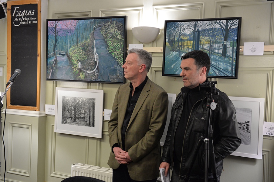
My colleague David Beese and I were, to say the least, very happy with how things had turned out
Sales
Then, to my surprise, we started to make sales. The exhibition was running for two weeks and we attended every day. We sold 20 pictures and took 12 commissions.
And now I am a full time artist! Since Both Sides of the River we have successfully staged another exhibition in the neighbouring village of Tongwynlais; I am currently working on a project with Transport for Wales, Amey and Alan Griffiths contractors, recording the changes to the Garth Works site in Taffs Well which is undergoing a multi-million pound, five-year transformation into a new rail transport hub. You could say I am the official artist in residence for this project. This all came about as a result of an employee attending my exhibition and seeing this picture of the site below.

Forgemaster’s Sheds, oil on board
I am now well into the project and an exhibition date is to be announced soon.
Another offshoot of that first exhibition is that I have agreed with the pub landlord/lady to keep the gallery going. We are now in the process of actually re-branding Fagins Ale and Chophouse as Fagins Ale and Arthouse. We will curate several exhibitions a year and use the gallery as the permanent site of an ever changing exhibition of my work.
Kevin Williams Art has a base and the future has become very exciting indeed for this humble yet newly professional, artist.

See more from Kevin on his website, www.kevinwilliamsart.co.uk, and in the PaintersOnline gallery by clicking here.
Portrait of Yvonne by Robert Buttle
There are certain things that I want from a portrait and they may differ from day to day and my processes and requirements have changed over the years as I have gained more experience to fill these wants and needs.
I generally work from photographs as, doing a full time job my access to life models is limited, it's also not an area of my development as an artist at this time, there are certain goals that I feel need to be achieved before moving on. At some point, once time is more available, working around live models will be inevitable. My main goal for now is observation - painting what is in front of me rather than what I believe to be in front of me.
As portraits float my boat, and as I assume most artists do, I spend time observing not so much a person’s face but how the lights, darks, tones, colours and structure make up a face. So if you see someone staring at you just think that they could be an artist checking your skin tones and bone structure …
Demonstration - Yvonne
The demonstration below is a typical Sunday painting.
For this portrait I used: Paynes grey, titanium white, yellow ochre, mixed skin colour, alizarin crimson, permanent rose, French ultramarine blue and Indian red as a glaze. Plus beeswax and medium.
I take most of the photographs I use for portraits myself, this has not always been the case and in the past I have borrowed pictures from all over social media. The photos are generally taken with low key lighting to give chiaroscuro effect (Rembrandt Lighting) the one of Yvonne was taken with a single flash from above and to the right.
Stage one - Squaring up

For speed and accuracy I will copy across by squaring up, some will call it cheating but to me it's just a way of getting to the part that want to gain benefit from.
For this portraits I used an oil paper primed with a mid-tone base acrylic. The mid-tone shows through and limits the amount of underpainting needed. The copying across is initially done with pencil which I then go over with red ball point. If I just use pencil then a wash of acrylic Paynes grey and water is used to seal the pencil, this too would give a mid-tone to the canvas.

Red ball point seems to work for me it disappears fairly well into the oil glazes.
Stage two - Underpainting (grisaille)
I underpaint in monochrome, in this case using Paynes grey, initially to block out the background and to start picking out the darks in the face, and using titanium white for the highlights.
As a reference I have the photo on a computer screen in grey scale, viewing the portrait and the study from about four yards away. Most of the time I paint standing up and am constantly walking backwards and forwards, taking reference, between my marks and the photo. Good if you have a pedometer!

I find it important to get as many of the darks in as possible early on as this builds structure and an illusion of depth.

Try and hold off on the titanium white as much as possible, while the Paynes grey is fairly translucent and can be applied in layers using the base colour to build the picture the titanium white is opaque and will block out all the underpainting. I also try not to mix the two as it will make a blue rather than a grey.
Stage three - Beeswax

Once the underpainting is thoroughly dry. An application of oil medium a little beeswax and Indian red oil paint is used. This allows any additional layers (glazes) to be added and blended. You can see already with a little of this mix applied that the portrait has the appearance of becoming more three dimensional.
Stage four - Tonal values

I try and work from dark to light but will go back into darks to get the tonal values correct.
I mix a batch of skin tone, which varies from time to time, but before adding it to a portrait it will always have another colour mixed with it - reds, white, blue, yellows.
Then it is a case of walking backwards and forwards, looking, stopping and looking some more.
Stage five - Hair

Hair and me are not really good friends as of yet. I tend to block in the general shapes of colour and tone and then add one or two stray wisps to give and impression of hair. Life is too short to start picking out individual hairs. Unless you are a 'picture sniffer' of portraits they are best viewed from a distance and the impression of hair should be good enough.
I’ve 'sniffed' a good many pictures, over time, just to see how the artists have gotten a certain mark onto the canvas, I am very often disappointed close up but amazed from a few yards away.
Final stages

With the portrait more or less finished, the blue of the shirt was deepened highlighted and darkened. Then some wiping out to remove paint and let the underpainting show through in places, and a few wisps of hair were added.
Self critisism
Being self critical is, in my view, and a way to progression and in this case I feel the painting is overworked; there is too much detail and it is a little too light.
Advice for anyone wishing to paint portraits
- Find a good portrait painting course, personally not having ever painted in oils before I went on a weekend course about five years ago. There are some very good inspirational encouraging teachers out there who can take you through step-by-step to a finished portrait, and even entertain you on the way!
- Don’t be afraid to experiment and copy for a reason.
- Try painting standing up and viewing your subject from a distance.
- Start off painting highly contrasting pictures, not of friend’s family or babies for various reasons not until you have a little skill. Don’t paint teeth.
- Leave the highlights till last.
- Most of all paint, observe then do more painting.
See more of Robert's work in the PaintersOnline gallery by clicking here.
Pochade makes Perfect with Sarah Jennings

In recent months I’ve been creating small paintings from the kitchen table or in the garden as we have got a new puppy who is going to need some serious obedience training before I let him into my proper studio at the end of the garden! I’m having to grab time to paint during puppy naps, which are often as unpredictable as the puppy!
Many of us have caring responsibilities and/or are short on time and are put off starting a painting by the thought of setting up everything and then putting it away. It is in these situations that I find that a pochade box has a lot to offer. I can create small paintings with the minimum of fuss from a ‘studio’ that is always to hand. It is the process of painting these small studies which is important, not the results. It’s painting ‘exercise’ without the need for lycra.
Most people who use a pochade box paint in oils but I am not a fan of the smell of turps or so-called odourless mineral spirits in the home environment. An alternative would be to use water mixable oils but that still means storing wet paintings. That’s why I often use acrylics.
Acrylics? Really? Don’t they dry really quickly? Yes, they do. That’s why I like them. I am a huge fan of acrylics both on their own and as part of a mixed media approach. I like to work quickly so the fast drying time is not a problem and I enjoy the interesting effects that painting in layers can bring. And those lovely dry paintings are easy to store. Why not give acrylics and a pochade box a try?
The pochade box

You can make your own if you are handy with woodwork (or know someone who is). You can even use an empty sweet or biscuit tin with a hinged lid. Ready-made boxes are readily available online. I have two, a small one which takes two panels in the lid each measuring 6” (h) x 8” (w) and a larger one which takes two panels measuring 10” (h) x 12” (w). It is the small one I use most and the one shown here. I’ve added a couple of screws to allow me to adapt it to take a 8” (h) x 10” (w) panel if I want. Painting any larger than this rather defeats the purpose of making pochade studies, in my view.
The paint surface


3 mm deep MDF or hardboard panels will slide into the lid of my small pochade box. You can also use shop bought canvas boards but it is best to check the dimensions first. I have found that these are often too thick to slide in because of the way the canvas wraps around the edges and I have resorted to trimming them with a craft knife. To be honest I don’t often use the spaces in the lid as I do not always paint in a landscape format and it’s difficult to paint the panel edges when the panel is in the lid. Instead I simply prop up my panel against the box lid and secure with blue tack or doubled up masking tape! Similarly there is no reason not to work on paper or mount board off cuts secured to board.
I prime my panels with a couple of coats of white acrylic gesso applied with a household decorating brush as I think the texture adds interest, although of course you can sand it down if you prefer a smoother surface. I am happy to paint directly on a white board but sometimes opt to add another colour as a ‘ground’ upon which to paint (I have some boards I’ve painted bright orange!) I chop and change depending upon what I have to hand and what seems to suit the subject.
Palette

Given that acrylics dry within minutes, keeping the paint workable is the main challenge. I am not a fan of ‘stay wet’ palettes as I find they make the paint watery. I frequently use a disposable tear off palette, which is great when out and about, but there can be a tendency not to put out too much paint on the palette for fear of it drying out and being ‘wasted’ and then trying to paint with pea sized blobs of paint!
My solution? Squeezing my paints into a small plastic bead box with a tight lid and predominantly mixing my paint on the surface of the painting. On the occasions I need to mix I use a disposable palette or the back on another painting board. Using my paint box means the paint stays moist and workable and I can use a generous amount of paint rather than being miserly. I scrape off any contaminated paint with a palette knife at the end of the painting session and occasionally give it a stir with the knife if I have not painted in a while. It is best to store the box somewhere cool. The advantage of a ‘pre-loaded’ paint box is that it is always ready to pull out at a moment’s notice.
Pictured above is my home made paint box which I bought for pennies from my local hardware store as a box for beads, screws and other small bits and pieces. It originally had only five wells; I adapted it to six by making a divider from a small piece of plastic.
Paints
I use the following limited palette of colours. I find I can mix pretty much all colours from these, with the possible exception of pinks/purples which might crop up painting flowers. I would then also bring along a tube of something like dioxazine purple or a magenta.
- Titanium White
- Cadmium Yellow Light
- Cadmium Red Light
- Cadmium Red Medium
- Ultramarine Blue
- Phthalo Blue
These are colours from the Liquitex Heavy Body range of acrylics although they are also available from other manufacturers under the same or similar names. I tend to use my paints straight from the tube (or should I say paint box!) but on the occasion I need to ‘dilute’ them I use gloss medium (again, something similar is available from other paint manufacturers). I only use water to clean my brushes.
Brushes

In the studio I tend to use long handled brushes to allow me to paint standing back some distance from the canvas/board/paper. In the pochade box I use short handled brushes. Rosemary & Co make a fabulous set of brushes especially for pochade boxes in their Ivory range ranging in size from an 8 flat to a small rigger. I tend to use the largest brushes in the set wherever possible so as not to get bogged down by detail.
After painting with acrylics do always rinse your brushes in water. Never allow acrylic paint to dry on the brush. If I am away from home I rinse them in water from my water pot and then wrap them in a moist paper towel in a sealed plastic bag. I then clean my brushes thoroughly when I get back.
Have fun with your paint box. The more practice we do the better we get. No more excuses not to start painting right now – once you’ve put the kettle on of course – or maybe walked the dog……..!

Pink Geraniums, acrylic pochade study, (8 x 6in.)
See more of Sarah's work in the PaintersOnline gallery by clicking here.
About Sarah
Sarah is an exhibiting member of Welland Valley Art Society and has found success in selection for a number of national art competitions/exhibitions including the Royal Institute of Painters In Water Colours and The Artist and Leisure Painter exhibitions at Patchings. She currently exhibits and sells her work in Stamford (through Stamford Arts Centre, Rutland Open Studios and Peterborough Artists Open Studios) and via her website www.sarahjenningsartist.com where you can find more information and links to her social media pages.
A Plein-Air Adventure - painting sunflowers with Sarah Stanley
Introduction
I enjoy painting outdoors, or en plein air, particularly using oil paints and have done so for quite a few years. Whether it's summer or winter, I love to be before my subject rather than rely upon photos to record a scene.

Sun and Snow, oil, (12x9")
That doesn't mean that I never use photo's! Sometimes it is impossible to paint on the spot. But I find the experience of en plein air painting helps me better understand the tonal and colour relationships in nature. Plus, it's a fun exercise, and if you're nervous about it, like I was to begin with, then stay close to home. I still paint scenes of my own back garden (see below).

Bottom of the Garden, oil, (12x9")
Finding inspiration
In June I visited Oak Tree Farm rural project, Nr. Stone, Staffordshire. It has a great tearoom and a small, but delightful, garden that visitors are welcome to wander through. They also allow people to sketch and paint, which is always worth checking. I had been before with Stafford art group and on this occasion, I found an earn potted with geraniums (see below), and spent a happy couple of hours painting it.

Scene from a Secret Garden, oil, (12x9")
Whilst there I noted a greenhouse, its reflective surfaces surrounded by various flowers, and a blue/green shed I particularly liked. I decided I would have to go back!
So in July I returned and, after walking round for a while, I came across the blue/green shed which now had sunflowers growing in front of it. I knew immediately that was the scene I wanted to paint!
I particularly liked the way a nearby tree was casting shadows onto the shed behind the flowers.The direction of the shadows seemed to emphasize the nodding heads of the giant yellow flowers. I used my view finder to zero in on the subject and decided to paint one flower to keep it simple. Sometimes, I do a sketch to help decide on the composition and to record the direction of light and shadows. But today, I was just eager to get on with it.
The support

My support was an 18x14" piece of canvas, glued to a piece of MDF. I had previously gessoed the canvas with gesso lightly tinted with burnt sienna acrylic. I find this helps reduce glare and makes it easier to judge tones. I normally paint oils on 12x9" canvas, but I want to push myself to do larger pieces.
Making a start

I began drawing with cobalt blue, glaze medium (Robersons) and a small brush. I started by marking where I wanted the sunflower to be by putting in the center of the flower and then adding dots to indicate the ends of the petals.
Sketching the sunflower

Then, I continued to sketch in the petals, stem and leaves, trying to put down the main outline but making sure they were accurate.
Adding the shadows
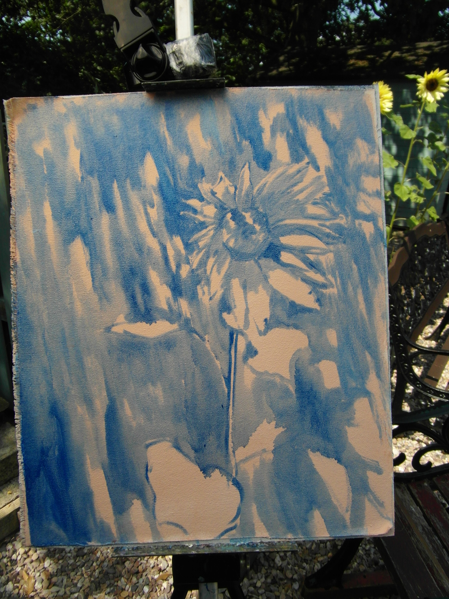
Then, using a larger hog hair flat brush and plenty of medium I put in the shadows on the flower, leaves and shed. I worked quickly before the shadows changed too much.
Finding the colours
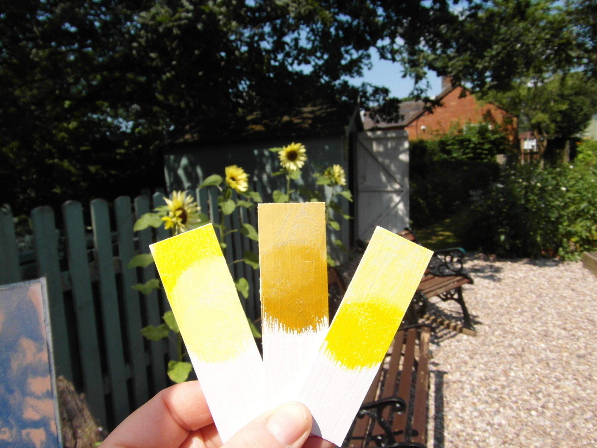
Once I was happy with the composition, I needed to go in with more colours.This part is usually a problem for me as I find it difficult to mix the correct colours and tones. I decided to try out a new way of working which I hoped might help. It involves using strips of gessoed board or card to which I applied a mix of two to three colours and then holding them up to compare them to the subject. I then either wiped off completely or adjusted the test colour until I found the correct mix. Then I simply mixed those colours on my palette. It certainly seemed to make it easier than just mixing colours on the palette. Although a bit time consuming, it probably saved time in the long run and I feel it helped create a fresher looking painting.
Blocking in

I used a large brush to block in, covering the entire canvas with the mixed colours. Then, I stood back to look at my work. I decided that the shadow on the flower was too dark. So I adjusted this using a soft brush loaded with paint and gently applied it to the previous layer so as not to disturb it. I also noticed that I needed a darker, warmer yellow on the upper petals closest to the centre.
Adding the detail

Midday Sunflower, oil, (18x14")
Using a small soft brush, I added some details to the flower, leaves, the negative spaces around the flower and tthe horizontal lines for the shed panels.
Conclusion
In all this painting took about two and a half hours to complete. The colours used were, French ultramarine, cobalt blue, cobalt turquoise, purple lake, yellow ocre, azo yellow light, azo yellow deep, burnt umber and titanium white.
Having finished this painting I realised that stopping to take photos for this demonstration may have helped me. Normally, I wouldn't stop the painting process once I had started. But stopping and looking and thinking more is definitely a good thing!
Although I have framed the painting, I am still not satisfied with the shadows on the shed, so I may go back and do another study and then possibly a studio version.
See more of Sarah's work in the PaintersOnline gallery by clicking here and on her website, www.stanleycrafts.co.uk