


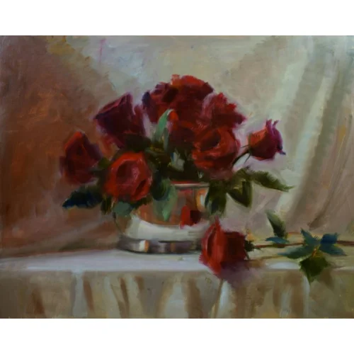
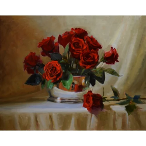
Sandra Corpora demonstrates a still-life painting of red roses in a silver bowl, using oils on an aluminium panel, and shares her top tips for exploring colour.

Deep Red Roses in Silver, oil on aluminum composite panel, (40.5x51cm)
'I was working towards a group exhibition of still-life paintings and thought to challenge myself by painting deep red roses in a silver bowl,' says Sandra. 'One of the things I like best about still life is that you can completely control your composition. It can take hours to get the elements chosen, arranged just right, and make the lighting behave for you.'
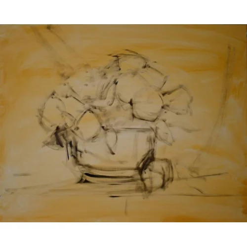
Setting up the still life
'I knew my painting was to be about the richly coloured red roses. For contrast, I chose a light drapery background, which even in shadow, would be about a seven on a value scale.
'I liked the contrasting brightness of the silver bowl that reflected everything around it, including me. So I wore something black and moved some things around in my studio to control what was in the reflection.
'I wanted the single light source to be from my north-facing window, although a supplementary light with a daylight bulb coming from the same direction is sometimes necessary. The point of view is also very important; in this case I wanted the bowl to be slightly below eye level.
'I used my phone to take photographs to check the placement of blooms, leaves, shadows, compositional lines, gaps, odd negative shapes, tangents, and anything that doesn’t look right. Be patient and deliberate at this stage. It’s more efficient to arrange your still life exactly the way you want before you start painting. Major corrections mid-painting will slow you down, not to mention sap your creative energy.
'If you’re painting flowers, they may need to be photographed during the painting process because a bloom could assume more beautiful shapes or lose the beautiful shapes it had. However, depending on the flower, they can give you several good days of ‘posing’. When painting, aim to capture first any shapes and colours that might change.'

Reference photograph
Colours and values
Red roses are difficult to paint because when in light and shadow, the value range of the blooms is mid-value to darkest value. So the challenge was to show the lightest value of red on the petals hit by strongest light and maintain the rich red colour. Using white to make a lighter red, I’d get pink and the chroma would be wrong.
I explored all my red paint tubes. I wanted to rank the colours from lightest to darkest reds and warmest to coolest, so that I could determine which reds to select for my palette. I wanted to have a good idea how I might achieve the rich red colours of these flowers before I started painting.
I squeezed out a little of all the reds I have – and I must admit I have probably too many – I could see that the red paint colours ranged in value from middle to dark and in temperature from warm to cool. The lighter red colours are mostly opaque and often cadmium colours. With this information I could narrow the choice of red colours for my palette.
These colour tests will be useful reference going forward. I now can see by brand how the colours and even the paint varies in consistency.

Here are my red paint tubes with the test swatches, labelled by brand and colour and tinted with white. On the right is a test with all my different alizarin crimson colours
Sandra’s top tips for exploring colour
- Make colour charts with the paints you already have. Understand how each colour tints to white and tones to black.
- What neutral colours can you make from each combination of yellow/red/blue – can you make black, grey, brown?
- Mix an orange, green and purple from red, yellow and blue. If your primaries lean warm or cool, they affect the secondary colours. That’s why a warm/cool for each of the three primaries can give you almost any colour you’d need.
- Read the fine print on your paint tubes. Know which colours are transparent or opaque. Try mixes with just transparent colours, then try some with just opaque colours.
- Paint manufacturers’ websites have detailed information about all the colours they make. Look at: michaelharding.co.uk or winsornewton.com or gamblincolours.com for helpful technical information.
- In most cases you don’t need the most expensive colours to mix the colours you need, but do buy artist-quality paints.
- Transparent colours mixed with white result in brighter mixes than opaque colours mixed with white. This can be useful when painting bright flowers.
- Try using lighter value opaque or semi-opaque colours to lighten when you can. Be judicious in using white to lighten as it can deaden a mix or look chalky.
- Use a neutral grey paper window or View Catcher to help you evaluate colours and values. Really know the basics of hue, value, and chroma.
- Vary your palette colours. Experiment with a limited palette to see how far it will take you (it’s OK to add a colour if you need to). There are many ways to mix the same colour.


Comments
Login or register to add a comment
No comments