


Almost without exception pastel pencils are the most popular choice of the portraiture student looking for a simple and logical approach to full colour portraiture. There are many reasons for this – not least the fact that they are a natural progression from all forms of pencil-based work. They are considered easier to handle than soft pastel sticks given that they are, initially at least, more controllable, and they definitely keep the hands cleaner.
My own use of pastel pencils stems back to the mid-70’s during which time 90 percent of my pastel portrait work was executed in pastel pencil, largely because they were convenient to use, economical and readily available in most art shops.
They also appealed to me on a more practical level. They perfectly illustrate pastel’s strength as a ‘drawing’ medium and constantly keep the student in touch with the idea that painting is a final result of numerous drawing stages. There is no difference between drawing and painting. Of course, the same can be said of all painting media.
Which pastel pencils?
Work in this article includes Conté, CarbOthello and Faber-Castell’s new Pitt pastel pencils. As a general rule they all work fairly well together. The Conté range is of a slightly ‘harder’ formulation, some would say ‘grittier’ than the CarbOthello pastel pencils, which are consistently smoother and softer. They both, however, come in a good colour range, which for my purposes is one that contains a selection of warm and cool reds, yellows, blues, greens and earth colours – colours which possess some intrinsic strength and, whenever possible, good ‘transparency’ which is vital for working one colour on top of another. Also, the ability to sharpen the pastel pencils easily is an important factor. Use a good sharp Stanley-type knife to sharpen them rather than one of the many flimsy craft knives available today, which struggle against the wood and cause numerous unnecessary accidents.
As for papers/supports for pastel pencils, you can use many paper surfaces but, without doubt, a good quality pastel paper will produce the best results because it will have enough ‘tooth’ to accept the various layers of colours as the portrait develops. My favourite paper surface is Canson Mi-Teintes, largely because I like to choose between the two distinctly different surfaces: between the smooth side and the rough side. For pastel pencil portraiture, the majority of my work is completed on the smooth side because it provides a near-perfect ‘non-invasive’ texture for the pencils.
Apart from the surface, the colour of the paper is an important consideration. Unlike sanguine where the paper colour choice is restricted to the ivory/creams to allow the dense red chalk to provide a full range of tonal values, full colour work demands different priorities. There are sound practical reasons for choosing papers for portraiture, but it can never be said that there is only one choice for any given job. As I often demonstrate, the same piece can be worked on two distinctly different coloured papers and the only really important difference is nothing more than a personal preference for one colour or the other. As a general rule I consider three basic questions when choosing paper.
Tonal value? When pastel ‘painting’, everything depends on the tonal value of the paper- too light and the bulk of the pastels will appear dark against it; too dark and the bulk of the pastels will look too light against it. You require a paper that is tonally in the middle of your pastel range so as to get the best balance of dark and light from your palette of colours.
Colour? Mid-grey? Mid-blue? Mid-green? etc. This is often an arbitrary choice. In portraiture be guided by the sitter’s skin tone, hair colour and the clothes he/she is wearing.
Warm or cool temperature? Again, this depends on the sitter’s skin tone and clothing, but it can make an enormous difference to the finished result especially if the paper itself is to play a part in the finished painting, as in my portrait of Young Degas. And, of course, there are different opinions on this, given the degree of fading that paper is prone to.
I give a general guideline to my groups. Choose three or four paper colours that will see you through a wide range of work. A mid-grey, pink-grey, blue-grey and khaki-sand colour range would enable a great variety of different colour approaches. Always use a good weight of paper (140lb). A word of caution: don’t expect good results from cheaper sugar papers. Even if they are similar in colour, they do not have the tooth that pastel papers have. I only use them occasionally for one or two colour sketches. It is possible to use speciality pastel painting surfaces for pencil work, especially pastel card. Although I tend to keep this for soft pastel work. I find its gritty surface reacts well to pastels for some portraiture.
Different effects – same approach
Whenever I come across reasonably clear photography I like to build on my own collection of studies of the Impressionist painters. Young Degas was completed as a demonstration piece on a portraiture residential course, and as such was completed in less than half an hour. I love to work under time constraints precisely because it forces you to avoid the tendency to produce ‘finished’ paintings.
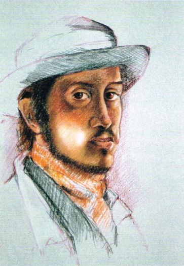
Young Degas, pastel pencils, (54.5cm x 37.5cm)
The accent here is on the drawing – most left deliberately unfinished. The blue-grey Canson paper was chosen to contrast with the warmer olive skin tones of Degas. Note the initial under-drawing in red earth is still visible in parts, and this example fully illustrates the technique of keeping the shadows ‘thin’ (almost transparent so you can see the paper through the densest darks) and the highlight areas ‘thicker’.
Elizabeth Vigee le Brun is of course a copy of her original oil self-portrait, which is in the National Gallery. It was produced as part of my series of ‘Portraits of Women Artists’ and it proved to be quite a tour de force in pastel pencils. It actually started out as a simple drawing study based on the original painting and grew from there. The pastel pencil work is specifically the face and upper body, the hair, the hat and trimmings. It is a good example of how pastel pencils and soft pastels can come together successfully in one painting. Soft pastels were used for the background, clothes and palette and I chose a deep cream Ingrès Fabiano paper (140lb) as a support.

Elizabeth Vigee le Brun, pastel pencils, (70cm x 49.5cm)
Old Jon and Bessie was completed using a different technique, willow charcoal and pastel pencil. I love the muted ‘antique’ effect that emerges from this old traditional mixture. Jon was, as he appears, quite a character. From studies and photographs I completed this piece on a full-size sheet of cream Canson paper, the warm cream shade having been chosen to support the analogous colour palette. I love this simple colour approach, especially when intending to leave the paper colour as a background.

Old Jon and Bessie, pastel pencils, (75cm x 54.5cm)
This piece is also about texture – Bessie’s fur, hair, rough wool, corduroy and an old felt jacket, all contrasting to give variety to the simple composition.
Willow charcoal mixes very well with both Conté and CarbOthello pastel pencils, and both ranges were used in this piece. The drawing was first established with willow charcoal, (much in the same way as the red earth was used in all the other examples) and the pencils were then applied in successive layers on top.
The George Adamson portrait was completed as a demonstration for CarbOthello pastel pencils when they were first marketed in Britain. I wanted a project that would put the new pencils through their paces. found George Adamson a fascinating study. For this portrait I chose one of my favourite Canson papers named ‘Cachou’, (I call it ‘Khaki’), and I feel it worked very well as a base to contrast Adamson’s tanned skin and fair hair. The lion cub was an added bonus. Again, the background paper was left almost untouched as a foil against which all the textures of the fur, hair and leathery skin tones contrast.

George Adamson, pastel pencils, (75cm x 54.5cm)
It just goes to prove that there isn’t a specific style of pencil portraiture. It is a medium with great versatility and variation that allows for all students’ needs.


Comments
Login or register to add a comment
No comments