


'I have been painting the flowers from my garden, along with various pots, jars and vases, since the first coronavirus lockdown forced me to look closer to home for subjects to paint from direct observation,' says Helen. 'Roses in particular have long been my artistic nemesis, so of course I choose to paint them frequently!'
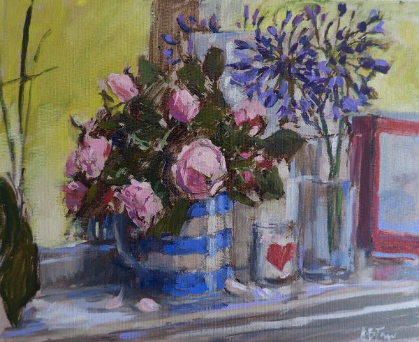
Roses in a Cornish Jug, oil on board, (20.5x25.5cm)
'I had one simple objective with this work: that it should be a lively response to the subject'.
SEE MORE FROM HELEN IN THE GALLERY
Helen's top tips for painting expressive roses in oils
- Have the light source to one side of the roses, this will enhance their shape. If the light is coming from directly behind you the roses will appear flatter.
- Select the right brush for the job. A filbert or curved flat brush is perfect for describing the shape of a petal in one or two strokes. A rigger will make light work of stalks and touches of light.
- Lightly sketch in the composition with thinned oils, then roughly block-in large areas of dark shadow. This quickly allows you to see and assess the layout of your painting.
- Pre-mix the colours of the roses, leaves and other key areas of the painting. If these mixes look good together on your palette they should look good in your painting. Mix tertiary colours to complement or echo your key colours.
- Check colours and values by holding the mixed paint in front of the subject on a palette knife and squinting at it through one eye, then adjust as necessary. The right colour and value will help you to paint efficiently with less reliance on detail and drawing.
- Stand or sit well back from your canvas or board and hold your brushes at arm’s length by the end of the handle. This gives a lively, loose mark and helps you avoid painting unnecessary details.
- Apply the paint in dabs and strokes without blending, to avoid dullness. Use mid-tones to transition from dark to light, or subtle shifts of colour or temperature to create visual blends.
- Think of the flower heads as simple sphere or egg shapes, then observe how light and shade describe their three-dimensional form. This will help you retain the shape of the flower as you develop the painting.
- Simplify the subject where possible. Step back and squint at the painting and your subject from time to time to assess the overall tonal relationships. Keep your initial intention and focal point in mind as you work, it’s easy to get distracted.
- Set yourself a time limit. Two hours should be about right for a small work. This way you will naturally prioritise the key elements of the painting, keeping your colours fresh and your brushwork lively.
Colour mixes
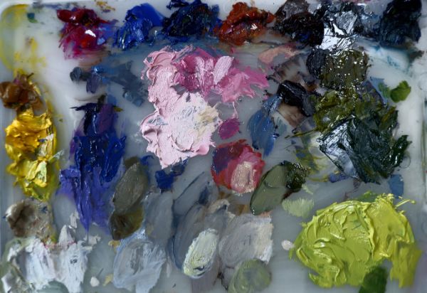
- Blue-brown made from burnt umber and ultramarine blue; I used this for sketching out and to rough-in the darkest areas of tone and to darken other colours.
- Pinks: a soft, mid-toned pink from magenta, yellow ochre and titanium white for the roses; I created a lighter tone by adding more titanium white, and a dark, warm tone by adding burnt sienna. A cooler deep pink was made by adding a little ultramarine blue to the mid-tone.
- Blues: the darkest purple-blue for the agapanthus was a mix of magenta and ultramarine blue lightened with titanium white for the lighter tonal values.
- Dark greens: I adapted the basic blue-brown mix with cobalt blue and chrome yellow to create a warm, deep green, and added more ultramarine blue to this to create a cool, blackish green for the darkest rose leaves.
- Lime-green: the vibrant lime background colour was created by mixing chrome yellow with a smidgeon of ultramarine blue and a touch of titanium white.
- Greys: burnt sienna and ultramarine blue with unbleached titanium for the warm greys on the mirror frame, mantelpiece and glassware. Adding yellow ochre and titanium white to this mix created the warm cream for the jug and mantelpiece edge.

Demonstration: Roses in a Cornish Jug

Reference photo


Comments
Login or register to add a comment
No comments