


What first drew you to the Winter Olympics as a subject for your digital artwork?
I’ve always enjoyed the Winter Olympics as a spectacle. It’s a rare moment where you see people pursuing very specialised sports with an extraordinary level of commitment and determination. These are disciplines most of us never encounter day to day, which gives the whole event a sense of intrigue and theatre.
Visually, it’s also a very distinctive environment. Many of the sports are fast and dynamic, yet they take place against a crystal-clear white backdrop. That contrast allows the human form to stand out in a very striking way, especially when paired with bold, brightly coloured sportswear. From an illustrator’s perspective, it’s a beautiful balance of simplicity and energy.

How does the energy of the Games influence your approach to drawing them?
Energy is the main thing I try to capture. The speed and intensity of the sports are heightened by the clean, white surroundings, and the athletes’ kit often reflects the colours of their nation. Helmets, goggles and aerodynamic shapes all contribute to a strong visual rhythm.
The challenge is translating that movement into a static drawing. I’m not interested in recreating a photograph. I want the drawing to feel like an expression of the moment rather than a literal record of it.
A big part of that comes from restraint. I believe that what you choose not to draw can communicate just as much as what you include. By simplifying forms and leaving space for the viewer to interpret, the image can feel more alive. That philosophy runs through both my illustration and my work as a branding designer. My goal is always to communicate a clear message with the least amount of visual noise, and let the audience complete the picture in their own mind.
I also draw a lot of countryside scenes and landscapes. Those work in the opposite way, where the subject is static and I try to introduce a sense of movement and energy through light, weather, or the changing seasons.
Are there particular moments, athletes or sports from the Winter Olympics that have inspired specific drawings, and how do you capture movement and atmosphere?
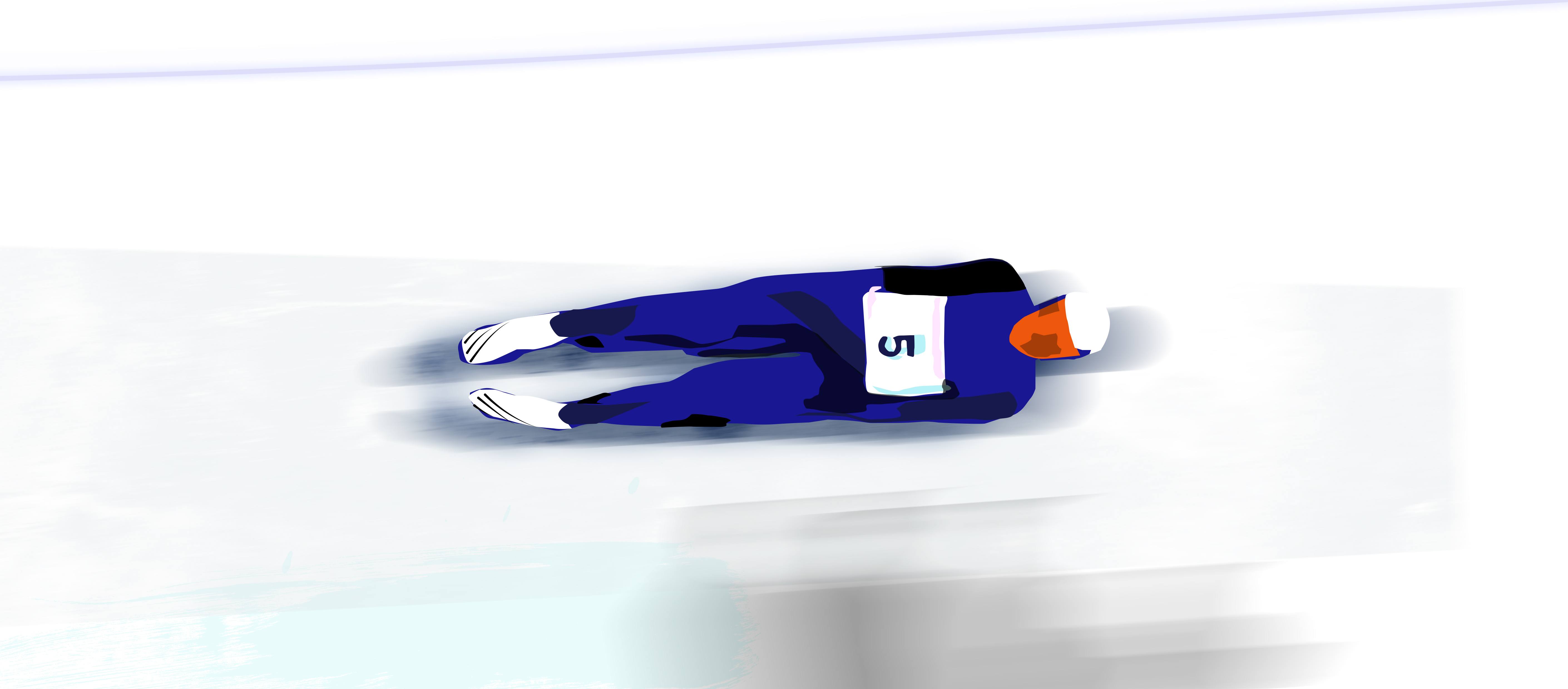
I’m especially drawn to the sports that combine speed with strong, recognisable body positions, such as skiing, snowboarding and luge. I’m also interested in drawing from figure skating, as it lends itself very clearly to expressive silhouettes.
Rather than focusing on a specific athlete, I look for universal moments. It’s not about a particular person, but about capturing the essence and feeling of the sport. I’m interested in the points where tension and movement are most visible.
To capture that sense of motion, I simplify the form and exaggerate the flow of the body. I often focus on the curve of a back, the angle of a limb, or the direction of travel. It’s less about detail and more about rhythm and balance within the composition.

How does working on Olympic-themed drawings differ from your other projects, in terms of technique, colour palette or emotional intent?
Most of my day-to-day work is in branding and design, where the goal is to communicate a business story clearly and strategically. That work is very considered and structured, even when it’s expressive.
The Olympic drawings feel more instinctive. The colour palette is often limited but bright and energetic, reflecting national colours and sportswear, and the compositions are driven more by movement than by messaging.
Emotionally, they’re about excitement, anticipation and admiration for the athletes. It’s a more personal, observational type of work, rather than something created to solve a specific commercial problem.
What do you hope viewers take away from your Winter Olympic art? Is there a message or feeling you want your audience to experience?
Above all, I’d like people to feel the energy of the moment. Even though the drawings are quite minimal, I want them to sense the speed, focus and determination of the athletes.
When you watch these sports, the attention is usually on the result or the achievement. By presenting them as static images, you can appreciate the visual beauty of the movement itself from a different viewpoint.
Ideally, the drawings leave space for the viewer’s imagination, so each person brings their own interpretation and emotion to the image. That sense of participation by the viewer is what makes illustration so powerful for me.
I’ve thoroughly enjoyed making these drawings and plan to develop new projects around sports such as tennis, cricket or rugby, alongside my ongoing work drawing from nature, landscapes and architecture.

Artist bio
Matthew Hancock graduated from Loughborough University in 2000 with a degree in illustration, and drawing has been a constant thread throughout life, from childhood to present day.
Over the years, that foundation in illustration developed into a career in branding and design. He now runs a branding studio, Number 75 Design, with his wife Eleanor, based in Lincoln and working with clients across the UK and beyond.

"Alongside my design work, drawing from observation, depicting colour, shape and form remains a central part of my creative practice. My personal artwork allows me to work more instinctively, exploring subjects such as sport, landscape and architecture, and I’m keen to develop this side of my work further. I’m grateful for opportunities to share these drawings and connect with a wider audience."
Comments
Login or register to add a comment
No comments