


Goldfinches and Thistles, acrylic, 12x12½in. (30x32cm). Knowledge of colour mixing enables us to create a summery atmosphere with bright, clear colours.
Follow this in-depth acrylic colour mixing guide by Jackie Garner to learn colour terms, colour biases and how they work, how to mix acrylic paint and how to mix bright, dull and neutral colours.
Best acrylic colours
I recommend buying the best quality paints you can afford. Avoid the cheapest, as these will have less pigment and possibly added filler. It’s better to buy a few better-quality colours than a big set of cheaper paints. Avoid big sets of tiny tubes of paint, too. The useful colours are consumed quickly, leaving the others to gather dust.
Acrylics are often sold in Series, increasing in price as the pigments become more expensive. Series 1 is the lowest price, while Series 6 is the most expensive.
When choosing paints, you may notice the word ‘hue’. This refers to a blend of pigments that resemble another, usually being an alternative to a more expensive pigment.
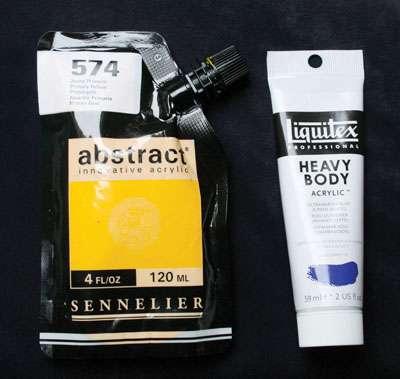
My recommendations are Sennelier’s Abstract range for student grade acrylics or Liquitex for Artists’ quality.
Colours may vary between brands, even if they have the same name, so one brand’s ultramarine will probably not exactly match another’s. Some names are different although the paint is similar in colour; yellow oxide, for instance, is close to yellow ochre.
Top tip: Buy best-quality titanium white – I suggest Liquitex or Golden – even if your other paints are student grade. Cheaper whites contain less pigment and may include filler so they aren’t as bright or opaque as top-quality versions.
Colours can be mixed (irrespective of brand) either by physically mixing the paint or optically, by laying down a colour then painting another (transparent) colour over it once it is dry; a process known as glazing.
Acrylic colours: colour mixing
Here are a few colour terms that you’ll find helpful:
Primary colours The three primary colours in painting are red, blue and yellow, which can be mixed to form any other colour.
Secondary colours Mix two primaries together and you’ll create another colour, which is known as the secondary colour.
Tertiary colours Combinations of all three primaries are called tertiary colours. Mix all three primaries and you’ll (theoretically) make black. You’re actually more likely to make a dark colour that depends on which three pigments you chose and how much of each is in the mix.
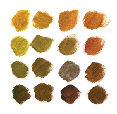
Tertiary colours allow us to mix a variety of browns, from honey colours through greenish shades to richer red or purple-based browns. These were all mixed from cadmium red, cadmium yellow and ultramarine.
Complementary colours A colour’s complementary colour is formed by mixing the other two primaries and is found on the opposite side of the acrylic colour wheel. Red is the complementary to green, for instance, which is a mix of blue and yellow. The other complementary pairs are blue-orange and yellow-purple.

Acrylic colour wheel 1 - This traditional colour wheel gives us vibrant orange, but more muted purple and green.
These concepts hold true, irrespective of which medium you use. The only difference is that white isn't used with watercolour, whereas the other media rely on white paint to lighten the mixes.

What is the best white acrylic paint?
We’ll need a white acrylic, but which white – titanium white or zinc white?
Titanium white is opaque, bright and even covers dark colours, although you may need a couple of coats. Zinc white – also known as mixing white – is a transparent white so it won’t cover underlying colours. If you want to lighten transparent colours while retaining transparency, choose zinc white.
Colour mixing combinations
Now for the primaries. We’ve already discovered that red mixed with yellow makes orange; red with blue makes purple; and blue with yellow makes green. This doesn’t tell us, however, how to make the specific shade of orange, purple or green we need. What if we want a bright, zingy green, or a softer, muted green? Why does this red with that blue make a dull grey colour, instead of the beautiful purple we desired? The answer is that results depend on which yellow we mix with which blue, or which red with which blue.
Clearly, we need a system that allows us to predict the result of our two initial colours mixed together.
Let’s start our acrylic colour wheel afresh. This time I want you to imagine that primary colours are never perfectly pure. Instead, every primary colour has a tiny trace of one of the other primaries in it. Red either contains a tiny part of yellow, making it an orange-red (for instance, cadmium red), or a tiny part of blue, making it a purplish-red (primary red or alizarin crimson).
Similarly, yellow will contain a hint of red, making it an orange yellow (cadmium yellow) or a little blue, making a green-yellow (lemon yellow). Blue will contain a trace of yellow to give a green-blue (cerulean or phthalo) or a trace of red giving a purplish-blue (ultramarine).

Acrylic colour wheel 2 - Choose the two primaries next to each other on the wheel for the brightest colours. The outer two give muted colours.
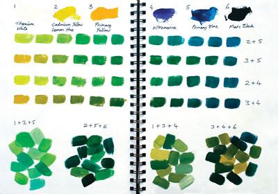
If we want a bright, zingy green, we choose the green-blue and the green-yellow, which both lean towards green so we can predict they’ll give the beautiful green we wanted.
Suppose we’d chosen the purplish blue with the orange-yellow? Both contain hints of red, which is the complementary of green. Complementary colours darken each other so we can predict that they’ll give duller shades.
If you're new to acrylics, don't stop here! Explore our other beginner-friendly guides to learn all you need to progress and develop your acrylic skills.
Acrylic colour mixing
Two reds, two blues and two yellows will give myriad combinations of bright or muted shades, even more if we lighten or darken them. Try these colour mixing combinations:
Green
- Lemon yellow + green-blue = bright vibrant green
- Orange-yellow + ultramarine = very dull green
- Any other combinations of blues and yellows = subtle greens
Orange
- Orange-red + orange-yellow = bright vibrant orange
- Crimson red + lemon yellow = duller, subtle orange
Purple
- Ultramarine + crimson = bright purple
- Green-blue + crimson = duller purple
- Green-blue + orange-red = greyish purple, useful for shadows
Once you know which two colours will give you a vibrant or a dull mix, try varying the amount of each in the mix. You should be able to create quite a variety of colours from just an initial two.
Acrylic colour mixing - Creating reference sheets of tints, shades and colour mixes is hugely beneficial. Try creating a range of secondary and tertiary colours. Always record which colours you used.
If you need a muted green that’s neither particularly bright nor dull, try a yellow that’s biased towards green with a blue that’s biased towards red, or a blue that’s biased towards green with an orange-yellow.
How to make acrylic paint more vibrant

Do you need light or vibrant colours over dark ones? Paint titanium white over the dark colour, allow to dry then paint the bright colour over the white. Left: several coats of opaque yellow over ultramarine results in a dull yellow. Right: a layer of white, sandwiched between a single coat of the same yellow and ultramarine allows the yellow to sing.
How to lighten acrylic paint
When we add white to a colour, we create a tint. Another way to lighten warm colours is to use a warm buff colour (called unbleached titanium, titan buff or buff titanium). These colours lighten while retaining the warmth of the original colour. White lightens a colour, but it’ll also make it cooler, which is not always our desired outcome.
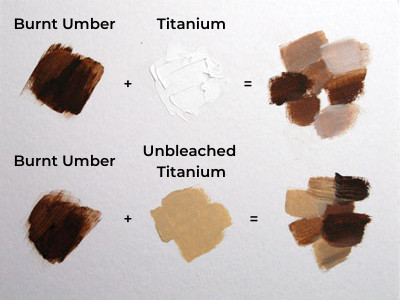
Mixing buff colours - see how much warmer burnt umber becomes when lightened with unbleached titanium instead of titanium white.
Mixing black acrylic paint
Adding black acrylic paint to darken a colour produces a ‘shade’; adding grey makes a ‘tone’. Black can be warm, brown-based (ivory black) or cool, blue-based (carbon or lamp black). Black divides opinion among artists. Some say it should never be used, others are enthusiastic proponents.
Those who dislike it deem it too harsh in a painting, mixing other colours to achieve their darks instead. I usually mix my darks, but sometimes use pure black for emphasis, making it a choice, not the default.
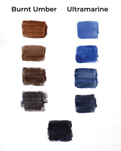
Mixing darks - Ultramarine mixed with burnt umber or burnt sienna gives dark blue or dark brown, depending on the quantities of each that are used. The resulting mixes are not as harsh as black and are harmonious when those colours are used elsewhere in the painting.
Colours can also be darkened by adding their complementary colour. Adding black may change the colour too much, such as adding blue-based black to yellow produces green, but adding the complementary colour darkens the original while retaining its integrity.
Colour mixing paints
Later, when you’re familiar with your paints, you may wish to introduce other colours. Colours that are useful in their own right are unbleached titanium and either yellow ochre or raw sienna. They’ll also create interesting new colours when mixed with primaries. Don’t feel every painting session must produce a finished painting. An occasional session exploring colour is both fun and hugely useful for your future art.

Home to Roost (Golden Plovers), acrylic, 14x20in. (35x50cm). We can choose to mix more muted colours to suit lower light conditions.
Now you know how to mix acrylic paint, put your knowledge into practise with Jackie Garner's guide to practising acrylic brush techniques and creating an acrylic landscape. If you're looking for more acrylic painting advice and techniques, visit our ultimate guide to acrylics!

Find out more about Jackie Garner, a Gloucestershire-based wildlife artist and her work on her website, via email [email protected] or read Jackie’s blog.
Comments
Login or register to add a comment