


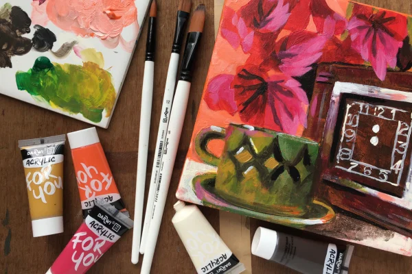
Learn how to use vibrant colours with Darwi Essentials Acrylics and brushes exploring mixing and layering
Why Darwi Essential Acrylics?
These versatile paints are a joy to work with, rich, creamy, and easy to blend. Darwi Essentials Acrylics are ideal for beginners and hobbyists alike. They offer excellent coverage, have a satisfyingly vibrant finish, and maintain their brilliance even after drying. Whether you're painting on paper, canvas, or card, they glide on smoothly and dry with a subtle sheen that brings your work to life.
Celebrate the vibrancy of pure colours using these Darwi Essential Acrylics. This still life project is perfect for beginners and introduces some useful colour combinations. It should also fire up your enthusiasm for mixing and layering.
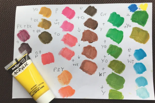
Colour mixing and acrylic application
For this project you will need:
- Small square 6in surface - paper, card or canvas
- A range of round and square Darwi acrylic brushes
- Darwi Essentials acrylic paints
- A mixing palette
- Water pot
- Paper towel
Step 1

A white surface can seem terribly daunting - so let’s make it less terrifying by covering the whole area first. Using one of the larger flat brushes, use a little water to dilute the vermillion orange and spread it about. Small areas of bright colour will pop through the darker tones and warm them up nicely. You can use a hairdryer to speed the drying, or let it dry naturally.
Step 2

Using a medium flat square brush and mix the yellow and blue together, to make a mid-green. The colours are pure so once you mix them, they will become more muted. Darwi's colours mix beautifully, and you’ll notice how subtle and natural they become when blended. Compare this mix with the tube of green paint, which appears much more saturated.
Add some of the yellow ochre colour (a useful colour, rather like sand) to the green to make a nice warmish mid-green. Experiment until you find a shade you like. Use this and the square brush to block out the shape of the cup and saucer, leaving enough room to add the clock and some foliage.
Block in the shape of the clock with dark brown, then switch to the magenta and throw in some heart-shaped leaves above and to the left. These colours block in well without losing intensity, even in early layers.
Don’t worry if it looks untidy and peculiar at this stage - we are just blocking in the main tones for now. All you have to do is check that the shapes are about the size you want them and that you are happy with their location.
If you're new to acrylics, don't stop here! Explore our other beginner-friendly guides to learn all you need to progress and develop your acrylic skills.
Step 3

Using the dark brown, mix it with magenta pink - the result is a luscious dark purple! Use this to block in more leaves, maybe adding some behind those you have already put in. You can try this colour on the face of the clock, to mark out that dark square shadow.
The depth Darwi paints provide even with small amounts of pigment is impressive. Their creamy consistency makes layering effortless.
Top tip: Keep your brush dry otherwise your paints will become too transparent - a paper towel helps when you have washed out your brushes.
Step 4

Using ivory, mark in the chrome front of the clock and the wall in the back right corner. You should also highlight the cup and saucer in the left bottom corner. This will make the shapes stand out.
This is where Darwi paints truly shine - literally! Once dry, they offer a subtle gloss that enhances dimension.
Try the fine-tipped round brush for the clock numbers. The brush quality pairs perfectly with Darwi’s smooth paint flow. Go for the edges first then add the numbers - mark the 12 and 6 first, then 3 and 9 to help you position the rest.
If the paint on your green cup isn’t quite dry yet, try brushing in some ivory gently into the left-hand side, where the light is hitting it. You might find this helps to give it more of a rounded shape. Yellow ochre would also work nicely here. With the green on your brush, you might like to drop a little into the background top, where there is a hint of green wallpaper.

Step 5

Returning to the dark brown, and using a round brush, paint some dark stars into the centre of the plant’s leaves. Add some decoration on the cup and strengthen the dark shadow on the clock face, between the numbers and the shiny chrome square. Create some shadows into the inner reaches of the plant. Experiment with shape and remember that quite random, abstract blobs of paint will give a good result.
Water the paint down with a little water. You can then create a shadow underneath the clock to help suggest that the light is coming from the left. Darwi paints dilute well with water, allowing you to create transparent glazes or soft shadows. The brush control and colour strength let you go bold or subtle, depending on how much water you use.
Top tip: Don’t panic if your painting looks messy - see it as a fun exercise with colour. You will have learned lots along the way and you can always paint over anything you don’t like.
Step 6

Mix magenta with a little ivory to pick out the lightest areas on the plant’s leaves. You might also like to drop dashes of this around other areas, like the teacup or the clock. With Darwi, colours mix easily without turning muddy. The layering potential means you can apply soft highlights over darker areas with great success
Step 7

Most of the main shapes are now in position, and you have more than enough to fill this modest painting. Acrylic paints tend to work best in multiple layers. Some colours are quite transparent and can therefore seem rather disappointing when first applied. Simply leave them to dry, then add more layers, shaping and refining your painting as you go along.
The Darwi paints are quite shiny once dry, so will give your painting a lovely sheen, especially with layers. You will also be able to start building up lovely textures as the paint becomes thicker on your work.
To finish re-mix the vermillion with a little ivory to re-colour the background. Neaten the edges of the pink leaves, and add a few splashes of colour on the metal clock trim to suggest a reflection.
You may notice that this project doesn’t use either the black or white paints. If you find your painting lacks punch, you still have these two colours in your arsenal. You can add a few white highlights which will add sparkle. Use the black to set your shadows even deeper.

Comments
Login or register to add a comment
No comments