


You’ll be delighted with a wealth of new earth colours from the highly-respected Williamsburg range of oils. Find out what they can do for your painting with Tony Paul.
In this article I will try out the range of earth and allied oil colours made by the American manufacturer, Williamsburg.
About Williamsburg Oils
The oil colours were first produced by artist, Carl Plansky, for himself and a fellow artist, but others in the artists’ community in Williamsburg – a suburb of Brooklyn – clamoured for these handmade colours.
Before long the demand was such that Carl set up the company on a fully commercial basis to supply oil colours that were as good as it was possible to make them.
The company burgeoned until 2009 when Carl died at the age of 58. The family wanted the company to continue so approached another well-respected company – the American acrylic colour manufacturer, Golden – to take over the reins of the company, which it did.
Top features:
- Packed with pigment
- No fillers and additives
- Less paint required to achieve depth of colour
- Lightfast
Where to buy
Willimasburg Oil Colours can be purchased from Jackson's Art Supplies by clicking here and from art shops and other online retailers.
Lightfast coding
Williamsburg, being an American company, uses the ASTM light-fastness coding and all those reviewed here are highly rated for light-fastness.
The tubes also show the degree of opacity or transparency of the colour inside in the form of a code comprising small squares

KEY
A = opaque
B = semi opaque
C = semi transparent
D = transparent
Earth Colours
The colours provided for this review are mainly based on earth pigments from France.
Most of the selected earths used by Williamsburg are simply dug up, washed and ground finely by France’s oldest pigment manufacturer from superbly coloured natural clays.
These vary in hue depending on their origins.
I have separated them into four groups: light earths, red earths, brown earths and ‘others’.
1. Light toned earths


The ochres and siennas are clays rich in iron oxide, which gives them a yellowish colour.
Traces of other metals and minerals will give colour variations.
Williamsburg French yellow ochre deep (A), French ochre Havane (B), French raw sienna (C) and French light sienna (E) vary considerably in mass tone but all, when reduced with white, have rich warm undertones that are useful for any subject.
Because it is nominally a yellowish colour I added green gold (D) to the light earths. This is a synthetic organic colour (PY129/5G). This type of pigment is known as a two-tone colour, because its mass tone is vastly different to its reduced colour. Unlike the ochres and siennas it is transparent rather than semi-opaque, so it’s good for reducing with a medium to create glazes.
2. Red earths

Red earths are often yellow earths that have been roasted in an oven, causing the iron to oxidise and turn reddish. The longer the roast, the darker and more purplish the red becomes.
Mars orange deep (A) is the one synthetic earth pigment (PR101) in the range, with a burnt orange warmth, whereas the French rouge indien (B), a natural red oxide (PR102) has a cooler purplish bias.
The two look very similar in mass tone; only when reduced do the biases become apparent.
3. Brown earths

The brown earths: French raw umber (A), French burnt umber (B), French brown ochre (C) and French burnt ochre (D), besides iron, contain manganese, which imparts a cooler greenish edge to the raw colours, and when roasted makes dark browns, usually with a degree of transparency.
The biases of these brown earths, which in mass tone are all fairly dark, feature yellowish, purplish, beige and greyish leanings, all rated as semi-opaque.
4. Other colours

Two earth greens have been added to the selection (see right): French ardoise grey (A) and French terre verte (PG23).
The greenish ardoise grey, as with natural Davy’s grey, is made from powdered slate (PBk19). It is transparent and fairly weak in tinting power.
Terre verte (B) is the historic, transparent dull green, used since ancient times for the under-painting of flesh in fresco and tempera paintings, and is still very useful in portraiture.
A further green (C) is one of my favourites, cobalt green (PG26). Being low in oil absorption and a fast drier, it is a great choice for under-painting, and a good substitute for the slow-drying viridian if you take your oils on holiday.
Another lesser-known colour (D), semi-transparent indanthrone (or indanthrene) blue (PB60) is a perfect substitute for indigo. Although much darker in mass tone than ultramarine, it reduces to give a clean, bright blue similar to ultramarine or cobalt blue, and helps create singing greens and purples, unlike high street brands’ synthesised indigo, which, made with phthalo blue and black, creates dirty greens and purples.
A surprise to me was cadmium purple (PR108) (E). Darker than the plum-coloured cadmium red deep, its reduced colour is excellent for shadowed flesh in portraits. I can see this colour being a firm favourite in my portrait palette. Like all cadmiums it is opaque and high in tinting strength.
The final colour for review is French noir Indien (PBk11) (F, above), known as Mars black in other manufacturers’ ranges.
Blacks can be problematic in oils. Both lamp and ivory black are based on soot, with a very high oil absorption and naturally very slow-drying paint film. They are also prone to sinking in, cracking or wrinkling.
The pigment used in the Williamsburg black is based on natural black iron oxide, which has much better paint film forming properties than the soot blacks. It is lower in oil content, a medium drier too, and semi-opaque.
ORDER A SET OF 10 FRENCH EARTH COLOURS HERE
Painting portraits using Williamsburg Oil Colours
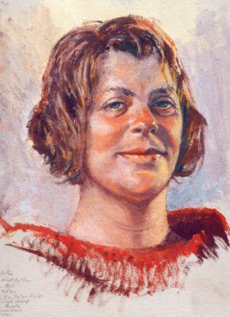
Chrissie, Williamsburg Oil Colour on board, (30.5x25.5cm)
The portrait of Chrissie (above) was painted at a portrait group over two one-and-a-half hour sessions. Unlike most models, who sit stock still, she chatted and smiled much of the time.
Many of us found this difficult, but in the end something of her lively personality ended up in my painting, which I doubt I could have caught otherwise.
The colours I used were:
- Cremnitz white
- Cadmium mid yellow
- Naples yellow
- Cadmium red
- French yellow ochre deep
- Mars orange deep
- Cadmium purple
- Indanthrene blue
- Cobalt green
The general flesh colour is a varying blend of French yellow ochre deep and Mars orange deep, lightened with white, with shadow areas of cadmium purple.
The ‘blacks’ were mixed from cadmium purple and cobalt green.
The shadow areas of the hair on the right were of an indanthrone blue and cobalt green blend, with a touch of cadmium purple to warm it a little.
Her irises were cobalt green and French yellow ochre deep.
The scrubbed in background was a purplish grey made from cadmium purple and indanthrone blue well reduced with white, and the warmly lit side of her face was Naples yellow and white.
I use little solvent with oils, keeping the density up, but the wonderful smell of the linseed oil binder was an added bonus.
The handling qualities of the Williamsburg colours were superb. No flabbiness here, just dense, solid colour that mixed easily – oil paint as oil paint should be.
Painting still lifes with Williamsburg Oil Colours

Glass & Brass, Williamsburg Oil Colour on board, (25.5x20.5cm)
My palette for the still life above was:
- Cremnitz white
- Green gold
- Cadmium yellow deep
- Permanent rose
- Mars orange deep
- French rouge indien
- Indanthrone blue
- French burnt ochre
- Cobalt green
I chose this subject, as I wanted to try out the green gold in particular, not having used it before in oils. I thought that it might work well in representing many of the colours in brass, using both the dark mass tone and the bright greenish yellow from its mixing with white.
- I drew out the composition in dilute Mars orange and blocked in the background with a grey mixed from indanthrone blue and Mars orange, then mixed Mars orange and cadmium yellow, cooling it down with a dab of cobalt green before reducing it well with white to block in the table top.
- To conform to the light from my window, I made both the wall and table fade to a slightly darker tone on the left.
- Clear glass is tricky, because a little information has to do a lot of work. I made the wall colour within the bottle a little darker and greener, but otherwise it was a matter of a carefully observed outline and a few highlights.
- With the brown bottle I had more to get hold of, using Mars orange and rouge Indien as base colours, and adding cadmium yellow, permanent rose, indanthrone blue and burnt ochre to put the subtleties in place.
- When the white highlights went in, the bottle came alive.
- Both the brass cup and bowl were based on the green gold, and every other colour in the palette played a part in bringing the objects to life.
Final thoughts
Being handmade American colours does mean that the Williamsburg Oil Colours are expensive compared to high street brands. But, when I squeezed out the quantities I would normally expect to use, I quickly became conscious that, because the colours were very high in pigment, I was actually using a lot less than I would have done with other brands.
So, in real terms, paying the extra for these colours may well prove a sound investment.
Sometimes we may include links to online retailers, from which we might receive a commission if you make a purchase. Affiliate links do not influence editorial coverage and will only be used when covering relevant products.