


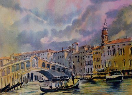
View of the Rialto, Bombay India inks on Sennelier 140lb Rough paper, (25.5x35.5cm)
Tim Fisher explains the techniques he uses to paint with these vibrant ranges of liquid colours from Dr. Ph. Martin
I’ve always been a big fan of inks; I love their flexibility and will look for any excuse to use them in my artwork.
Inks are available in a number of different forms, and I was pleased to have been asked to try Dr. Ph. Martin’s range of inks and watercolours, which arrived at my studio in three sets:
- Bombay India Ink (12 colours)
- Hydrus Fine Art Watercolour (12 colours)
- Radiant Concentrated Watercolour (14 colours)
What's the difference between acrylic and Indian inks?
I’m often asked about the difference between acrylic and Indian inks.
Acrylic inks are a polymer with exceptional flexibility and durability; they are quite intense and flow in a similar way to Indian ink. I often use diluted acrylic ink to create coloured backgrounds for my pastels.
Indian ink was invented in China and is also known as Chinese ink. It comprises of carbon black with gum and resin, and is sometimes moulded into stick form. It was only after trading the source materials from India that it then took on the name of Indian ink.
Indian and Chinese inks are waterproof and popular with calligraphers, illustrators and fans of ink line drawing techniques. They contain shellac, a resin secreted by the lac bug, which helps to make the ink more permanent'.
Hydrus Fine Art Watercolour

I started my experiments using Hydrus watercolours.
These are packaged in liquid form using bottles with eyedroppers. The eyedropper system allows colour mixes within the range to be reproduced accurately by counting the number of drops used.
They contain fine Artist pigments, which are intermixable, acid-free and lightfast.
The colours on the labels were all familiar to me so I felt quite comfortable working with these.
The packaging is well designed; the clear plastic lid has formed divisions, which can be inverted and used as a convenient palette.
The painting
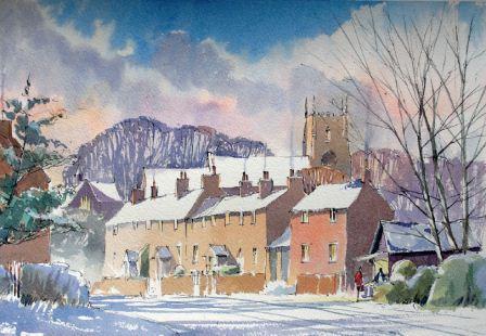
Woolsthorpe, Hydrus watercolour on Sennelier 140lb Rough paper, (23x30.5cm)
- Using a black fibre-tipped drawing pen, I loosely sketched out the street scene for Woolsthorpe (above) onto stretched Sennelier Rough watercolour paper.
- Using the eyedropper, I put out drops of ultramarine, alizarin crimson and yellow ochre.
- Pre-wetting the sky area, I fed in a diluted wash of ochre and crimson. Ultramarine with a little crimson was then fed into the upper sky and allowed to bleed into the damp paper.
- Once I was happy with the cloud forms, I mixed cloud shadow using ultramarine, alizarin and a touch of ochre.
- The trees behind the church were painted using a stronger mix of the cloud shadow colour.
- Working down the painting, the local brick colour was added using a mix of burnt sienna with a touch of gamboge.
- Greens were applied using sap green with a little Hansa yellow light.
- Finally, when bone dry, I washed shadows over the foreground and buildings using a mix of alizarin and ultramarine.
- The icicles hanging from the gutters were added at the end with a fine brush and titanium white.
Top tips for using Hydrus Watercolour:
- I noticed that due to their liquidity, the colours soon ran together in the palette to create unwanted mixes. To overcome this, don’t drop too much paint out at one time.
- The colours are 25 to 50 per cent brighter than tube watercolour so a little goes a long way.
- Also smaller amounts are easier to manage when keeping mixing areas clean.
Bombay India Ink

The Bombay India inks were next to be tried. I decided to dig out one of my old steel-nibbed dip pens to see how well these inks performed.
The painting
View of the Rialto, Bombay India inks on Sennelier 140lb Rough paper, (25.5x35.5cm)
- Using the brown, I drew a view of the Rialto Bridge (below). I was pleasantly surprised to see how well the ink flowed from the dip pen without any blockages or blotting. This gave me the confidence to work more quickly and assuredly as I would with a fibre-tipped drawing pen.
- Once the drawing was complete I applied the coloured India inks to the surface.
- Using stretched watercolour paper again, the sky was wetted. I was pleased to see that there was no ink bleed from my initial drawing.
- As the surface partially dried, I fed in the blue to which I had added a touch of diluted bright red. The paint flowed and behaved in a very similar way to the Hydrus watercolours and wasn’t difficult to control.
- Washes of yellow with a touch of brown were glazed over the buildings and allowed to dry.
- The tiled roofs were added with a mix of red and yellow.
- The water was created by a series of short horizontal strokes with a fine brush, reflecting the colours of the buildings on the shoreline.
- Finally, strong intense darks on the base of the boats and water’s edge were added using the black.
Top tips for using Bombay India ink
- It’s important to keep in mind that these colours are quite permanent.
- Once dry they are difficult to lift out.
- Keeping a tissue to hand and dabbing out any mistakes while still wet helps to overcome this problem.
Radiant Concentrated Watercolour

Castle Street, Leicester was the next scene, which I first drew out using the brown Bombay India ink on watercolour paper.

Initial ink sketch for Castle Street, Leicester
It was over this that I decided to apply the Radiant Concentrated Watercolour.
Again, the design of the packaging is very good; bottles slot into holders in a tray so there’s no risk of knocking them over and spilling the contents.
The clear lid has divisions and makes a handy mixing tray. The wide range of colours is very powerful and should be applied well diluted with water after first shaking the contents in the bottle.
The painting

Castle Street, Leicester, Radiant watercolour on Sennelier 140lb Rough paper, (23x30.5cm)
- Progressing with the painting, a wash of daffodil yellow mixed with ultramarine blue was applied over the foreground tree.
- To darken the green, I introduced mahogany into the mix.
- The wall was painted using a mix of amber yellow and wild rose. I varied the amount of water added to enhance tonal interest through the washes.
- Finally, after letting the painting dry thoroughly, I applied shadows over the buildings and foreground using a mix of ultramarine blue and crimson and a large soft brush.
Top tips for using Radiant Concentrated Watercolour
- For the really strong darks I found mixing ultramarine, mahogany and sepia worked very well.
- Care should be taken with these dye-based colours, as they are not lightfast and will fade in strong sunlight.
- Applied to sketches in a cartridge sketchpad they work very well and make a good colour reference for producing future artwork.
Tim's final thoughts
Dr. Ph. Martin’s Radiant Concentrated Watercolour, Hydrus Watercolour and Bombay India Inks are distributed by Global Art Supplies.
For more information and for stockists, telephone 01980 625625 or visit www.globalartsupplies.co.uk