


In this painting project I’ll explain a process whereby you can turn an inspiring summer scene into a winter landscape. We’ll look at how to compose the subject and use extra references to make important observations, before adding elements from our imagination. Next month, I’ll show you step by step how to create the finished watercolour painting, but in the meantime, we’ll prepare the ground work.

Reference photo 1 with Glastonbury Tor in summer
Careful observation of snow
Unless you’re lucky, it might be that you don’t see much countryside when it snows (if it even snows where you are).
Reference photo 2 (below) was taken near the edge of Bristol where I live. It is not the most inspiring view, but there are things we can learn from it. Note how dark and almost colourless – virtually black – the trees and tufts of grass are. It is partly our visual perception, owing to how glaringly white the snow is by contrast, but also with low winter sun there is the effect of silhouetting. Note also how blue the shadows are and how the shadow over the foreground means that the eye is drawn over it into the sunlit area.
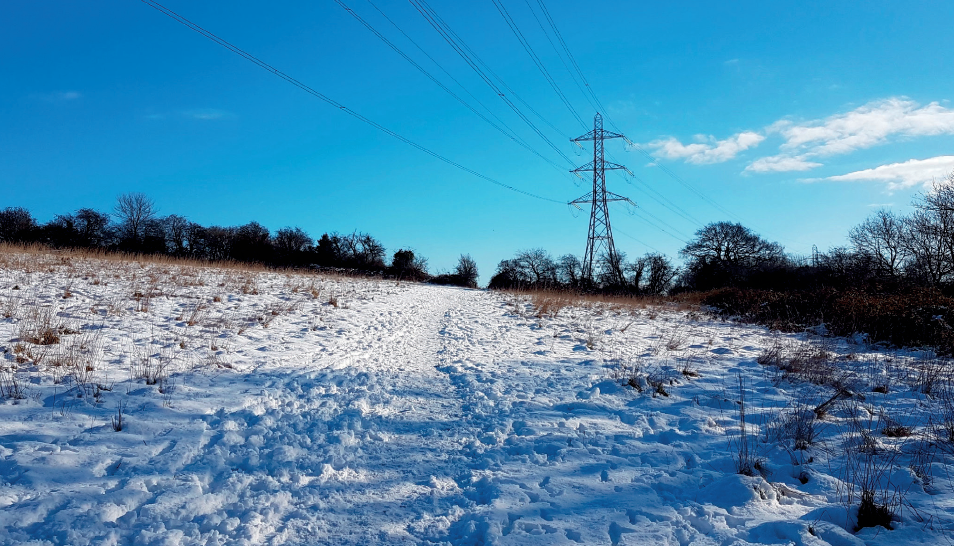
Reference photo 2: this photo is uninspiring perhaps, but still useful as a snow reference
A more interesting view can be seen in Reference photo 3 (below). I photographed this facing towards the light with the sun a bit off to the left. Again, the close-up darks especially are very dark, but there is a little bit of a warm maroon tinge to the bramble in places. Note how the pathway acts as a lead-in towards the distant hillside and the woodland, on which there is a paler tone and a slightly blue colour.
Shadows are again blue and blue-grey. The shadows resulting from a low sun are long and silhouetting is one reason everything appears dark. Low sun often provides some warmth in the sky as we move towards sunset, although that wasn’t the case here. If you’re able to google ‘winter skies’ or ‘winter sunset’ and click on Images you’ll find plenty of examples, which you could use as references.

Reference photo 3: this is a more interesting composition to observe carefully for your finished painting
Composition
To convey a landscape it helps to ensure there’s a sense of depth. Always keep this in mind when taking reference photos of a subject that inspires you. Here I decided I wanted the Glasontbury Tor as my focal point. I then moved up and down the path taking photos at intervals, with the tree and gateway at different distances away so I could see which worked best. I also checked that the pathway was positioned off-centre to avoid symmetry.
It can pay to take one or two photos that are of a wider angle than you might need, since you can always crop down from them later. Combining photo references, observations and a bit of imagination we can create a small, tonal pencil sketch of a composition.
The sketch

The small compositional sketch to test out ideas, 4x4in. (10x10cm)
Here are the processes I took to make the small tonal sketch, above.
1. I cropped down from the summer reference photo (left) to zoom in a bit. This made the tor – our main feature – a bit larger and the tree closer, which helped to add depth to the painting.
2. I simplified the scene, by leaving details out, including the number of fi elds. I didn’t worry about replicating where trees were, except the main one. Others could be moved to help balance the scene, as I also thought about their shadows.
3. I added a figure walking through the snow, to help grab the eye and draw the viewer along the path into the scene; colour will help with this. From there the eye is taken further in towards the ultimate focal point of the tor. I also changed the type of tree to make it a typical Somerset willow, and emphasised its shadow to break up the foreground and provide the eye with something to ‘step over’.
4. I shaded in cloud in the sky, positioning it behind the hill and tor so it showed up as light against dark, making the most of the snow aspect. Note, this is very different from the reference photo of the scene, where the hillside is much darker in tone than the sky beyond.
All of the above provided foreground, middle ground and distance (depth) and plenty of interest to move the eye around the composition. Some key elements were also positioned at points of one-third into the composition, which created a good balance for important area of the scene.
It pays to make a tonal sketch rather than just doing a line drawing, since this will give a truer likeness to any painting that you are planning, and will better show if your composition works. Sketches need not be large; the one you see above is about 4in. wide – and don’t worry about neatness; it’s a working plan for testing ideas.
The colours
Now, let’s look at colour and practise mixing from just three. I used Indian red, raw umber and French ultramarine, for the finished painting (see the April issue of Leisure Painter, out on February 19, 2021).
You could just as well choose three similar colours if you don’t have these. Being that these are essentially a red, yellow and blue (the primary colours) it means that we can obtain three other (secondary) colours by mixing them. More important than any specific colour names are their visual qualities, which include how bright (saturated) or dull (greyed) they are.

Colour is subjective and should always be a personal choice. I prefer muted, earthy colours, in general, perhaps a bit on the dull side. As we mix colours, they also become less bright; you can see this in the green here, which is very different to one you’d mix from brighter primaries. It is really quite grey for a secondary colour, but nature has taught me to prefer subtlety; please use colours that inspire you though. Practise mixing from your three primary colours before you paint.
We can vary the exact nature of the secondary colours by using different amounts of the paints; for example, what is loosely termed purple could vary between plum or maroon depending on how much of the Indian red and French ultramarine are mixed. Any three primaries mixed together make a grey (neutral) colour. The opposite of grey and neutral is bright and saturated, and we can’t get more saturated than the primary colours are before mixing.
In distant areas of landscape, greyed colours are often seen, with brighter colour more commonly shown closer up. Then there’s warmth and coolness, for instance, red and blue. Warmer colours are less perceived over distance, with far off woodland or hills often appearing somewhat grey-blue.
So, three colours quickly become six and, whether those are bright or dull, warm or cool is just as important. We’ll use this knowledge in the final painting next time. Perhaps find your own reference photos and three colours, or feel free to make a start from mine. Have fun with it and I look forward to seeing your finished work!
Leisure Painter features two-part painting projects, such as this one by Jem, every month, click here to see reader versions of previous projects.
Comments
Login or register to add a comment
No comments