


Richard Joseph Burton, oil on linen, (80x70cm)
Kathy Barker takes an in-depth look at painting eyes, showing you how to capture expressions and emotions. Learn how to lay in the basic structure of a pair of eyes and work through to a more finished result.
Materials
Rather than working on a pure white canvas, a slightly tinted one will be better when judging the lighter tones. Mix a little black and yellow ochre with turps and apply this to the canvas; use a clean rag to wipe back and you will have a clear transparent ground. It is best to prepare this the day before so it can dry.
I use earth tone oil paints: warm white, cadmium red or Chinese vermilion (the latter is much more expensive), yellow ochre, ivory black, raw umber and burnt umber are useful additions as is light red (for lighter areas of the face), and Venetian red (for shadow).
Grey Ivory black plus white makes a good grey hue to dip into – add to your other hues to de-saturate.
Green Yellow ochre and black will give you your greens, cold and warm, by varying the ratio of each hue.
Lilac/purple made with black, white and red.
Chocolate brown add burnt umber and light red to your colour base.
Greeny brown add raw umber and light red to your colour base.
Skin tones you can mix a whole range of colours with cadmium red, yellow ochre, white and a little grey. Use less ochre to go towards the pinks and for ochre/orange use less red.

My choice of medium is Michael Harding Oleo resin but you could use plain linseed oil if you prefer. Have rags handy for dabbing excess paint onto – this will control the flow of paint on your brush – and some turpentine.
I use hog-hair brushes and move onto mostly sable when working delicate areas. Size: 0, 2, 5, 6 are useful for delicate highlights to more sweeping gesture.

The warmer peachy colours of skin tone will make your mixed greys appear blue

The eye form gets a little more almond-shaped (or slightly squint-like) when a person smiles slightly; the effect is heightened when a person really grins

On a profile eye, make sure you leave enough space between the eye to the bridge of the nose

Down-sloping eyes
The eyebrows
Start with the shadow side of the face and begin with the eyebrow. Search for the angles, an eyebrow pared down to its simplistic structure is essentially made of two angles: the longer stretch and then the angled hook or shorter stretch/flick at the end of the eyebrow.
If you’re unsure of what those angles are, close one of your eyes and align your brush until it is parallel to the angle part of the eyebrow. Without moving the brush, twist your waist back to your canvas; the angle of your brush is the angle/slant of your eyebrow.
Paint/draw in the shadow side of the bridge of the nose just down from your eyebrow, using the angle-finding technique described.
Define the eyes
Rather than making any sort of outline of eyes, just lightly dab where you think the iris/eye is. Observe the distance from the eye to the bridge of the nose.
Top tip Beginners tend to place the eyes too close to the bridge of the nose, so try to avoid this.
Once you have an eyebrow and smudged-in area of an eye you can judge the distance in terms of space from one eyebrow to the next.

Check the alignment
Before proceeding, make sure you have the correct alignment of one eye to the other by checking the angle relationship of the two eyes. Are they on the same level? They need to correlate, particularly if the head is in a tilted posture.

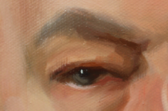
Richard Joseph Burton (detail)
It’s sometimes useful to use the lower lashes of both eyes to check they are on the correct axis by using the angle-finding technique. When you have lightly scrubbed in where you think your eyes (irises) are, just take a moment to reflect and judge the distance from these to the actual eyebrow. Will you have enough room for eyelids, for example? At this stage it is easy to smudge back any area and shift anything you may need to.
An eyelid stands out because of the shadow or darker hue that has been painted behind or underneath it, as does a thin dash painted to describe the inner lower eye rim
Creating the shadows
Once your spacing and angles have been painted, go for the shadows. These are easier to see on a shadow side of the face: the inside eye corner paralleling the bridge of the nose and eyebrow, and also the shadow that runs underneath the outer corner of the eye.
Shadows also exist on the lighter side of the face around the eye but are very much lighter.
Mix your various hues according to your sitter’s skin tones.
Top tip yellow ochre, white and black make hues that help to push form back in space.
If you're new to oils, don't stop here! Explore our other beginner-friendly guides to learn all you need to progress and develop your oil skills.
Modify with just a little red if you need to warm it up, especially the colours under the eye.
As you paint, note the eye shapes. Some people have tilting-up eyes like cats, or the reverse where the inner corner of the eye is higher than the outside edge. Some eyes are just on the same level. Be observant – what can you see?

Painting the irises
If you are still sketching, these can still be painted in raw umber. A little bit of raw umber and white is usually a good hue for the whites of eyes as there is seldom pure white in the eyeballs – pure white is reserved for highlights.
Top tip If you do use pure white for the whites of eyes, your portrait will look odd and the eyes will take on a staring quality and appear much too harsh.
Get your iris ellipse shapes right: a good indicator is to look at the actual triangular shapes from the iris to the corners of the eye – we see negative shapes better sometimes. Are your irises too big or too small, oval, elliptical enough? Indeed, have you made the eyes too big in the face?
If you are using a side lighting set up, note that the iris hues are actually lighter on the shadow sides. Pure black is used for the pupils. If you go wrong with anything you can use a finger to smudge back, or use a soft fan brush, wiping your brush on a cloth after each feather stroke so you don’t spread paint where you don’t want it to go.
Finishing details
Softening hard edges of any form is always a good idea as it immediately makes the image appear more three-dimensional and allows you to accent a line here or there, such as the eyelash lines.
Soften eyebrows similarly, painting a half tone above your eyebrow, then use your fan brush to blend.

Kathy Barker studied fine art painting at Wimbledon School of Art and portraiture at Charles Cecil Studio, Florence. Kathy tutored for several years at West Dean College and currently teaches at the Roehampton Club, London, and holds a weekly portrait class at her studio in Fulham. She has exhibited with the Royal Society of Portrait Painters and exhibits annually with the Society of Women Artists, of which she is an associate member.

Comments
Login or register to add a comment
No comments