


'The beginning of the floral year, spring is the season of light, bright colour that reflects the freshness of new growth, young shoots and buds,' says Ann Blockley.
'It is a good time to get back to basics, start afresh, and remind yourself why you chose watercolour as your medium in the first place. The purity of watercolour is ideal for capturing raw, clean colours and delicate petals, as the translucent medium allows white paper to shine through fresh unsullied washes of luminescent paper.'

How to paint clean fresh washes
In spring, the clean fresh washes of traditional watercolour are particularly appropriate.
It is important to master the wash technique – both for large expanses of background and for smaller areas within the flower itself.
The vital point to remember is to prepare plenty of dilute paint since you cannot easily interrupt a wash if you run out of colour.
When using varieties of colour within a wash, you will discover that the clearest combinations result if they are mixed on the paper instead of on the palette. To do this, dilute each choice first in separate compartments of your palette and let the different coloured brushstrokes blend themselves on the paper.
It is important not to dab. The damp marks should merge where they meet without needing further interference.
Use as big a brush as possible. Too small a size may result in a fussy wash.
You can try painting on either dry or wet paper.
Remember to compensate for the fact that any moisture on the surface will further dilute the paint and so the colour will consequently be paler once dry.
Colours
When you imagine spring flowers it is the piquant colour schemes you remember most sharply.
Citrus yellows and violets will sting with clarity.
It is the combinations of hues that sing so loudly.
These complementary colours intensify each other, which explains why so many early flowers and their leaves appear extra bright.
Use this knowledge to give your paintings added zest.

Violets
Violets, above, shows the process of developing flowers out of a wash
Simple flower shapes
During this period of revision and learning, it is helpful that the emerging flowers are often appropriately simple, compact and unpretentious.
These easy flower shapes and pure colours are perfect for practising simple watercolour exercises.
All the elements of the Nosegay picture (below) are built from a variety of uncomplicated washes on a miniature scale.
The texture of the leaves is made by dropping water into a drying wash.
The flowers are either small variegated wet-in-wet washes or gradated washes that change tone within the petals.
I left the background white to let air and light in and to keep the springtime freshness of this posy.

Nosegay
Painting buds, blossom and bulbs
Keep your washes as pale and transparent as possible when painting blossom.
Thin layers of dilute watercolour are more appropriate than single applications of thick paint.
Work cautiously; you can always add, but it is more difficult to take away and retrieve that precious sparkle of clean paper.
Define pale flowers by using the darker tone surrounding them, rather than by using an outline. This is a real psychological barrier to be aware of. In real life, objects are not enclosed by lines!
The contrasting value could be a darker leaf, part of a bough, a blue sky, or simply the shadow from another flower.
A quick, effective way to give buds roundness is to paint the whole shape in one wash then drip clean water into it when the edges are drying but the centre is still moist. This will shift the paint outwards, leaving the middle of the bud paler and the edges slightly darker.
Painting primroses

Primroses, Watercolour, (18.5 x 24.5cm)
After the long winter, primroses are one of the most joyful sights of the year.
In the painting above I tried to express my appreciation of this uncomplicated pleasure in a simple picture using modest colours of greens and yellow.
Interest lies in the contrast between wrinkled leaves and the smooth complexions of the flowers.
Painting daffodils and primroses
My painting of daffodils and primroses (below) uses the light, joyous hues and flowing wet washes of traditional watercolour.
In reality, the background to this scene was a sea of further flowers, but I decided that a drift of complementary mauve-blue behind them would enhance the dazzle of the yellow.
A simple approach with clean, pure paint captures the essence of this springtime subject.
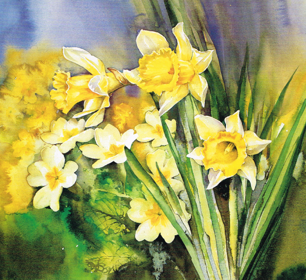
Spring Flourish. Watercolour, 11 x 12½in (28 x 32cm)
Sketching spring flowers
In spring it is probably still too cold and showery to spend hours painting outdoors and so sketching is the obvious solution.
It is not just the physical value of a sketch as reference material that is important, but also the time spent observing the subject whilst drawing. You are likely to absorb more information than is actually transferred to paper.
Qualities such as movement, scent and change of light are experienced and stored in your memory to add to the atmosphere of later works.
Because you work more quickly and it is after all ‘only’ a sketch, the results are often looser, less inhibited than in an ‘important’ finished painting. A really good sketch is highly selective, gets straight to the heart of the issue and is not side-tracked by arbitrary details.
Losing the detail
In the wild the sheer quantity of flowers is breath-taking.
When flowers mass themselves they lose their individual shapes and characteristics; they become more abstract. Detail is pared down to the essentials.
A hedgerow of wild garlic becomes a lacy texture. A wood of bluebells is an unadulterated blur of intense colour. We can summarise whole meadows with broad washes of colour, or spatter yellow paint with a toothbrush to approximate a million buttercups.
Flowers are represented by a general approximation of marks. The simplest washes of colour and flecks of detail can be enough to create the effect of a carpet of flowers.
Creating depth and distance
When you paint a mass of flowers, it is relatively simple to imply a feeling of distance by gradually reducing tone, texture, colour and size.
Due to perspective, objects appear to diminish as they recede, making the flowers in front look bigger.
Think about blue mountains to remind you that colours appear cooler from a distance and, conversely, that warm colours tend to come forward. The same principle applies to tonal values and colour intensity.
Strong colours leap out and weaker washes retreat. If the flowers at the back become progressively blurred as they fade out of focus, this will also lend depth to a painting.
Dabbing dots of wet colour into damp washes is an invaluable way of capturing this sort of scene. Detail will only be seen in the flowers at the front.
Similarly, a few leaves and stalks may be noticed in the foreground, but these are inconsequential as the view retires. Picture a wild flower meadow. The flowers hover while their support system of stems disappears into a haze of green.
Painting a meadow
I have created depth in Meadow Flowers (below) by using a number of devices.
The dandelion clocks and buttercups in the foreground were blocked out with masking fluid to give prominent crisp edges. These focal points were painted in a detailed style whereas the flower impressions behind were left soft-edged, and loosely described.
The colours and tones are much stronger at the front and the flowers are bigger.

Meadow Flowers, (17.5cm x 14cm)
Learn more watercolour painting techniques with Ann Blockley's Watercolour Workshop


This article was originally published in the March 2001 issue of Leisure Painter. Enjoy endless inspiration with access to past and present issues of both Leisure Painter and The Artist magazines, plus exclusive video demos, tutorials and more, with our Studio Membership! Discover how you can join today.
")


Comments
Login or register to add a comment