


For the next few months there will be too few daylight hours for my hens to lay a single egg or for me to get in a good day’s painting without help from electric lights.
The obvious advantage of electric lighting is its manageability; we can turn it on at will, point it in any direction and make it brilliant or dim. Sunlight is wonderful; it casts fabulous shadows, glows through petals and fabric and creates dazzling highlights, but it is rarely there when you want it, and the only certainty is that it will move.
At this time of year switching on the lights before I start work can double the hours in my painting day. Don’t imagine you can just turn the lights on when the sun goes down – electric lighting will always be different, but if it’s ‘glow’ you are after, a light bulb can actually beat sunlight.
Where to place lamps
The ability to move lamps around to show a highlight on a piece of china, or to make a gilded design twinkle is a creative opportunity. I find china decorated with gold or gilding on old books fascinating to paint, and I also enjoy being able to make it glint to order. or this it is important to have light from one general direction only, so that plenty of the gold is in shadow to provide contrast. Paradoxically, gold seems to look most like gold when most of it is actually dark brown.
Light from one side of the objects you are painting is helpful for a three-dimensional effect because the different planes of the objects catch different amounts of light, and good shadows are cast. Looking directly from the front you can see both lit and shaded surfaces. I find this equally important for ceramics, fabric and flowers, and contrive to light up some petals and shade others. Folds in fabrics and the curves of china are much more fun to paint when you can see strong tonal differences between one side and the other. Overhead or all-round fluorescent lighting (which exists at every adult education venue that I know) produces either no shadow at all, or shadows in ten different directions and is a disaster for still-life painting.
Backlighting with a lamp can produce lovely effects, but also the problem of the light dazzling the painter. This can be overcome by lowering the light sufficiently for it to disappear behind one of the objects or by skewing it partly to one side so that it is not pointing directly towards you. The effect produced by shining a light through fabric in this way is often beautiful, and was the main reason for painting Pansies and Napkin (see below).
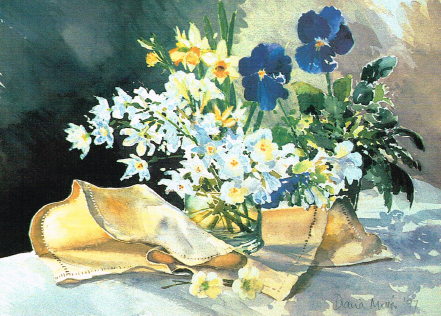
Pansies and Napkin, watercolour, 11 x 15in (28 x 38cm)
The light glowing through the napkin drew my attention. The contrast between the opaque edge and the translucent single layer of linen helps to emphasise this.
To supplement or replace daylight

Boris the Bear Hunter, watercolour 21 x 29½in (53.4 x 73.5cm)
This was painted entirely by artificial light, leaving dark areas in the background as a foil to the white china and linen. The very dark tones were mixed from complementary pairs – typically burnt sienna and ultramarine or permanent rose and viridian.
The only way to achieve completely constant light is to eliminate all daylight from your studio while you are painting. I have done this experimentally; for example, both Boris the Bear Hunter (above) and Lamplight (below) were painted with the shutters closed. But it seems perverse and bad for morale to shut out the little daylight we have in the winter, and I reckon I can get away with letting the daylight in if I work at the end of the room furthest from the window, particularly if it is not a sunny window. In my studio, which has central room lights, I then turn on the main light (tungsten bulb) and this reinforces the light from almost the same direction as the window. Anglepoise lamps, again from the same direction, complete the system and I notice little change of light when darkness falls, and can carry on painting.

Lamplight, watercolour, 10½ x 13½in (26 x 35cm)
The only light sources for this were the lamp in the picture and an anglepoise with a daylight bulb pointing down onto my paper. The base of the coffee pot receives light reflected from the pale napkin, but the pile of saucers and the coffee cups are deeply shadowed underneath, the wood being too dark to reflect light up to them.
A positive advantage of low ambient light levels is that a lamp can create a pool of bright light, rather in the manner of a spotlight, so that the unlit areas appear very dark. Seventeenth-century Dutch still-life painters enjoyed the drama of this effect – perhaps it was first noticed when the oldest spotlight of all, the candle, illuminated some flowers on the table. Chardin set many of his still-life paintings in the same windowless alcove, using this sombre background to emphasise the beauty of the glowing fruit, glass and silver chalice that he painted.
Choice of lamp
I use one or two anglepoise lamps, shining brightly onto the subject with standard 60-watt tungsten light bulbs. These give a convenient directional light and a lovely warm yellowy-orange glow. However, this form of light is not good for working by so you will need another anglepoise, this time with a daylight bulb shining down onto your work. This system works fine in practice. As long as the daylight bulb is an anglepoise-type lamp and pointing downwards, the light on your work alters the lighting on the subject that you are painting very little.
The same slightly orange quality of the light that gives a warm glow to the objects it lands on also modifies our perception of the colours. These are the same changes that you would get if you were to add a little bit of orange paint to all the colours. So through the reds, browns, oranges and yellows there is just a slight strengthening and warming of colour, but blue is a different matter. Orange and blue are a complementary pair, so they have a neutralising effect on each other, and bright blues will be dulled slightly by the orange bias of the light. I must say that this change has never bothered me at all with a group of objects that I have painted, but I know that the effect exists – as will anyone else who has dressed on a winter morning by the bedroom light to arrive in daylight and find themselves wearing an odd and unintended mixture of navy and black clothes.
Highlights
Well-lit, shiny, curved surfaces (most china and glass) reflect brilliant points of light which are far brighter than the white of watercolour paper or any white paint, and provide a challenge to depict. After all, the best that we can achieve is ‘white’. We can’t actually make the paper radiate light. The challenge is particularly noticeable when painting white china because you are trying to highlight white on white, but it is also a good exercise in assessing tones.
Provided you paint the same relative tonal difference between the highlights and the areas around them, the highlights will show up. This of course means painting the surrounding areas, which we see as ‘white‘ in something darker than white. Here the orange bias provided by the light bulb is an asset because it gives a good warm colour with which to paint the surrounding areas without a tendency to look dirty.
The whole business of depicting light on paper feels to me like a dangerous balancing act – fall on the ‘too dark’ side and the effect is dingy, whilst on the ‘too light’ side is the wishy-washiness which many people associate with watercolour. If you choose to paint a group made up entirely of mid-toned objects and backgrounds it is more difficult to avoid murkiness than if your chosen objects include a full range of tones from black and white. I often choose some really rich colours, which in shadow produce extremely dark tones and add punch. To balance this I need plenty of white (hence my white cloths) to keep a degree of crispness.

Duck Eggs and China, watercolour, 21 x 29in (53.4 x 73.5cm)
Painting a number of white objects against each other is a good exercise in observing tones. The jug shows how dark the surrounding tones can be in order to show up a sparkle of light on white china, yet we still see the jug as white. Strong light from the side made the folds in the cloth much more interesting to paint.
Dark tones in watercolour
Very dark tones are often needed when painting a brightly lit subject in order to show those areas that are out of reach of the light. They are easy to make in watercolour. You just need Artists’ quality paints (for intensity of colour) and you need to darken with a complementary colour. To produce a really dark green, for instance, add some permanent rose.
I back the ‘throw out the black’ brigade – particularly for beginners. Instead of using black paint I suggest mixing from a complementary pair of colours. The most useful of these for a deep, dark, unlit area is ultramarine blue/burnt sienna. When balanced these can make a proper black but, better still, slightly out of balance they produce ultra-dark brown or ultra-dark blue, both of which are great for recessive darkness.

Sally’s Primroses, watercolour, 9½ x 7in (24 x 18cm)
The books provided a convenient rich background to show up the primroses. The decoration on the books was achieved simply by negative painting over a previous wash of the yellow/brown of the gilding. By using a lamp I was able to move the light around until nearly half the petals were in shade.
Reflected light
Reflected light is a delightful side effect of bright lighting. If there is sufficient intensity of light, some of it will bounce off a pale surface and light up part of a nearby object that you would expect to be in shadow. The reflected light is usually warmer and less intense than the direct light and merges gently into the shadowed area. In watercolour the effect can be achieved using wet-in-wet painting. It is important to paint the areas of warm, clean colour first, followed by the cooler, greyer shadow colour to avoid everything ending up neutral.
Such ‘little’ effects of light as this are very easily seen but not always noticed, yet they can lift a painting from good to breathtaking.
So try not to doze off in your cosy winter studio. If light is important to you in your painting, you need to be acutely aware of what you really can see, not what you expect to see. For the final stretch we are all on our own.

Shaker Boxes and Iris, watercolour, 14 x 15½in (36 x 39cm)
This is an example of warm light produced by a normal tungsten light bulb. The corner of the dresser is a favourite spot to paint because of the vertical element provided by the right-hand end. I have developed a conviction that drawing with a brush is the best way to work, but it is particularly challenging when painting white china which often ends up askew.

")


Comments
Login or register to add a comment
No comments