


Just Google “painting water” and you will see hundreds of articles, tutorials and videos on the subject, which apparently will help you to “paint water like a pro.” So what can I possibly add to this tricky subject? Well what I will attempt to do here is just to say how I go about it and it certainly isn't a definitive account of how to do it.
It’s strange having to think through how you paint a subject that you have been painting for years because it really does become second nature and you don’t think about the different stages. Whether you paint in watercolour (as I do), oil or acrylics everyone develops their own style. Heaven knows why I had to veer towards painting highly detailed watercolours but that’s what I do and I cannot say my painting of water in this medium is conventional at all. In my style water certainly gives me the chance to paint relatively freely though, which can be a relief!
OBSERVATION & DRAWING
Unless your style is totally abstract then the first stage is always going to involve intense observation. Just as a portrait artist has to observe their subject very closely to get “the essence” of the person, the proportions and the overall look, an artist painting the sea, a lake or a river must firstly totally study the water.
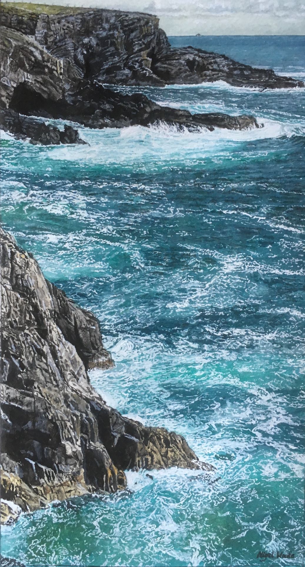
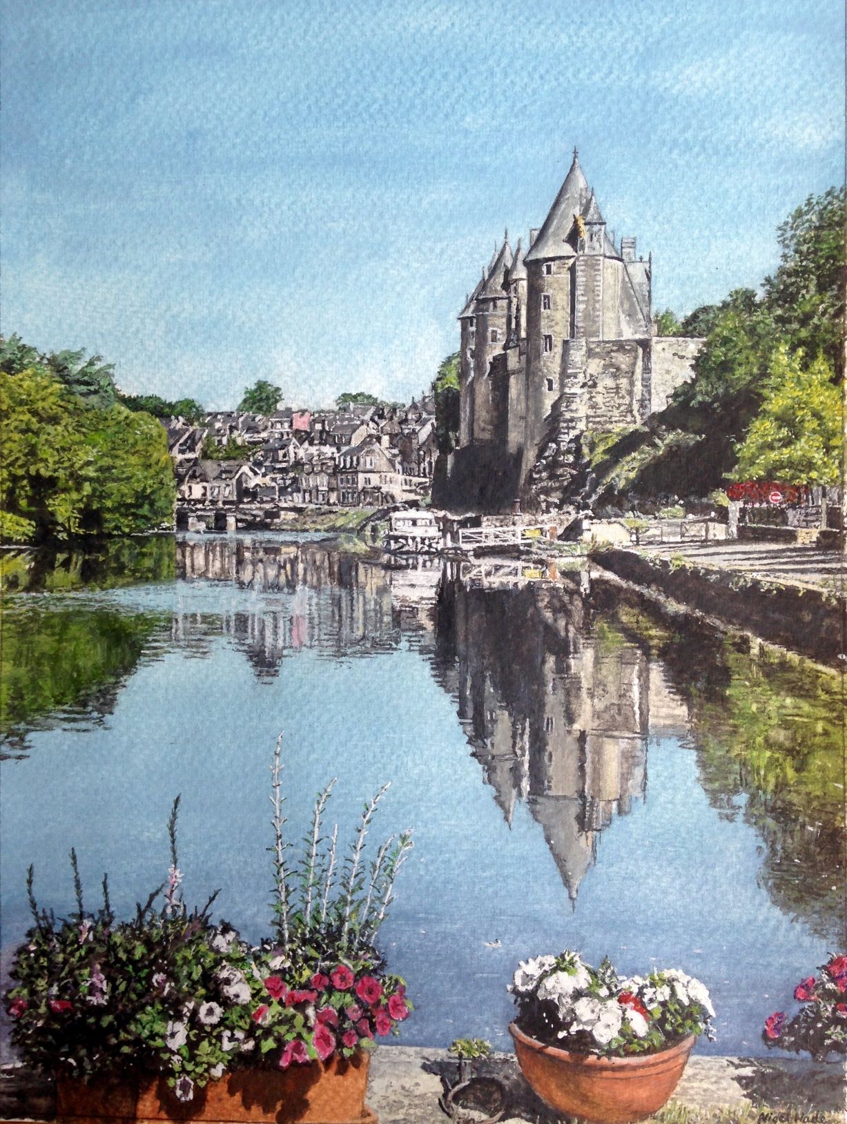
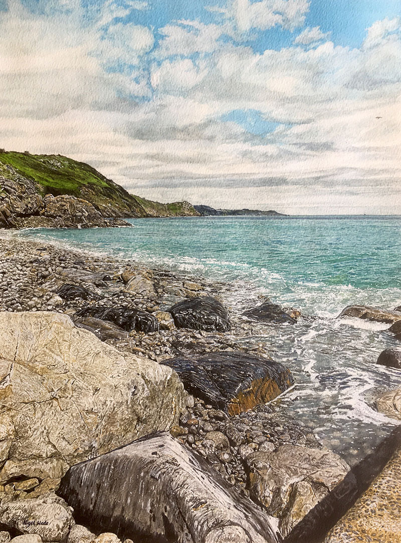
It’s always different depending on the light, the weather and the season. Take these three paintings for example, the water couldn’t be more different in each:

All of these started with the same observation though, having identified the composition of an image I want to paint I usually take a number of reference photos. I have never done plain air painting - I think I should sometime - so my photos have to capture what is there for me. I usually use an iPad as I can magnify the detail as I go.
To get the water looking like water it’s critical then to transpose all this observation on to the blank paper through very careful drawing. I don’t mean the detail, just the overall shape of the area of water, the shape of the waves, the edge of the beach and so on. If this isn’t right, if the perspective isn’t spot-on, then you can never correct it once you start painting, not without great difficulty anyway.
COLOUR & PAINTING
Getting the colour right so that the light is shining off the water, or the reflections are right, or the reeds underneath look real is the next big challenge. It’s probably my favourite part because I don’t normally cover paper so quickly and I just love getting that colour exactly right.
Again it starts with observation, because when you look hard the colours can surprise you. The bold turquoise of the Mediterranean, the green/ grey of the English Channel or the crystal clear water of a river with reeds swaying in the current. If I don’t look carefully, really study what is there, I just can’t get the colour right. Plus with watercolour you always have to allow for the fact that it dries a slightly different tone. Here are three paintings with very different colours in the water:


I mix quite a lot of different paint colours together, I keep trying it on scrap watercolour paper, until I’m happy with it. Then using a very broad brush (up to 3") I apply the paint evenly, working quickly to avoid lines and overworking it. That base coat is going to form the basis, it can’t be too thick otherwise I can’t lift it if I want the paper to shine through. However, the way I do it, it’s not just a wash and I will go over it later to vary the colour as needed.
If you look at the painting above of “Hastings from The Pier” the variation in different tints is quite staggering really, there is grey, green, turquoise, brown, yellow and white in the water. With the shadow from the clouds, the depth of the water, the waves, the sand being churned up and the light from the sun, it is just so variable. First though I get the overall colour of each area as accurate as possible.
HIGHLIGHTS AND DETAIL
So now I have something that looks vaguely like water but there’s so much work to do to really bring it to life. Once again I start with careful observation. Each patch of water tends to be different so I tackle one area at a time. These two pictures below can show how I do this:

On both of them I painted the far distance first, going over the base colour with light brushstrokes to indicate the waves and the different tones. I do follow the detail from the photo image fairly closely but not exactly.
Then it’s onto the breaking waves, the ebb and flow of the sea and the wet sand. My favourite tube of watercolour paint here is Titanium White, which is whiter than Chinese White and really adds the sparkle to water. Wet sand is not easy to get right, I think it’s usually the reflections that make it look wet so be bold with the colours of the sand and the contrasting reflections.
Of course you don’t have to paint every single bit of froth exactly as it is and sometimes I change things as they don’t look real, but I do observe carefully and pretty much go for the overall effect from the reference photos.
Then I’m at that exciting stage where the whole painting is virtually done, but I do keep looking it all over and tweaking bits, so I have a rule with myself that once I’m certain it’s done, I sign it and I’m not allowed to touch it again. The rule usually works!
I will finish with a pictorial step-by-step of the water in Hastings from The Pier showing each of the stages:


Read Nigels' guide to painting skies and clouds in watercolour.
See more from Nigel in the gallery by clicking here and on his website, www.nigelwadeart.com
")

")

")

")


Comments
Login or register to add a comment