


I realised many years ago that I was not a studio painter. I wanted to paint the landscape directly from nature. With this came the decision to specialise in watercolour, even though I have a natural tendency towards the oil painter's way of thinking.
Watercolour is a very convenient medium to use in the field. I only need to carry a few tubes of paint and some water in an old squash bottle, all packed into my fisherman's box which doubles for a seat, and my paper masking-taped down to my board. I use 2001b Bockingford watercolour paper, which does not need to be stretched beforehand.

Martin Taylor working from his jeep
I spend days walking and looking for compositions. Very often the 'next picture' presents itself after a spell of working when I least expect it. It is very important at this time to make a quick drawing in my small sketchbook, as ideas are just as easily lost as they are found.
I think of my paintings as journeys into which the viewer enters, looks around, travels in, through and out. I find many compositions on hills or high vantage points from where you can see into the far distance.
First the sky
My first consideration is the sky, which needs much thought. Constable spent time closely studying clouds alone, and indeed we can learn much from the Masters by observing the colours they used. I am always aware of the close relationship between sky and landscape and the effects of light upon it. The sky needs to be worked as carefully as the tiniest twig or grass Studying the sky at any given moment through 360 degrees I see all sorts of colours, tonal changes and different cloud formations. But what really concerns me is the area directly relating to my composition
The 'white' of the sky and clouds appears to me not as pure white, but as a very pale tone, so I start with a wash of cadmium orange fading out from the horizon upwards. I am careful to make this only the slightest of tints, then from the top down I wash in a tone of cerulean fading out into the orange. Note the perspective of clouds and colour in the sky; how the clouds recede in distance nearer to the horizon.
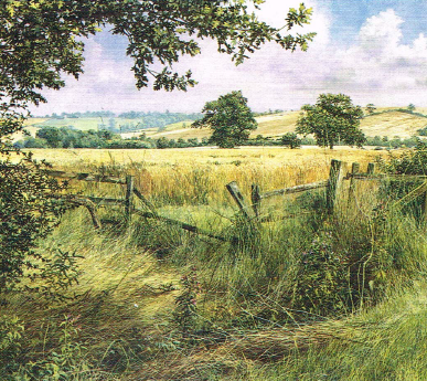
Over the Fence towards Lamport, watercolour and body colour, (36.2 X 39.3 cm)
The actual sky colour 'blue' may not necessarily be found straight from the tube. I use 14ml tubes of Artists' quality watercolour paint, and mix cerulean, French ultramarine, violet, Payne's grey, cobalt and neutral tint to achieve that elusive colour. Neutral tint is a good base for the colour of cloud shadows. This can be dropped in when the sky washes are just damp. I avoid generalistic spreads of very wet colour in favour of more careful work.
I try to maintain pure watercolour technique here, as the introduction of a white body colour such as gouache can lead to all sorts of awful problems. It is sometimes necessary to overlay successive washes - when washes are bone dry - in order to create the depth of colour required. Timing in watercolour is all important. never leave a wash until it is dry, as unwanted effects can occur right up to the last minute.
If you look at the skies of the Victorian watercolour artists, in particular Miles Birket Foster, you will see how 'drawn' they are. It is possible to paint with quite a small brush the detail of shadows and shapes of clouds - in fact more so than is generally accepted
Finally, I use dampened white toilet tissue to get rid of any hard lines that may have occurred in my sky, and most importantly I try not to overwork or rework the sky once I am satisfied, just because I see another effect.
The process
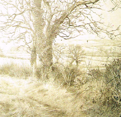
Fully worked preliminary pencil drawing for The Lane at Hanging Houghton
I always start by working out the elements of his composition in detailed pencil drawings which become works in their own right, before lightly sketching in the compositions for his paintings.

The Lane at Hanging Houghton, half completed, watercolour and body colour
Starting from the left-hand side, I work across the picture, completing the work in small areas as I go. At times whole sections will be finished while others remain blank. In the smaller areas I start with pure watercolour and then use white and yellow acrylic enabling me work back light over dark. This allows me to add further washes if necassary and the painting progresses in layers until I'm fully satisfied.
The Finished painting

The Lane at Hanging Houghton, watercolour, (38.5x41cm)
Watercolour and acrylics
As well as the scale of the drawing, distance is achieved through the use of colour and aerial perspective. I must add here that I do not use any ready-made greens as I prefer to mix my own colours. I use three acrylic colours: azo yellow light, cadmium yellow medium, and titanium white mixed with my blues for this, with the addition of burnt sienna, yellow ochre and Vandyke brown for the earth colours.

Spinney Silhouette, watercolour and body colour, (27.3x50.8cm)
Often taking up a large part of the composition, a sky establishes mood and atmosphere
Popular advice on watercolour technique would be to use pale tones of the correct colour and to allow the white of the paper to show through I 'distance' my colour by layering washes of white acrylic. It takes some nerve, and it seems as though I am eradicating what I have, but the white 'sinks' and through practice it is possible to judge the correct strength. This technique originated from the need for correction, as colour dries differently from its appearance when wet. I feel that the effect of my white washes gives an airy, atmospheric quality.
Trees and grasses
Coming to the middle distance, I now encounter trees. In the winter months when the trees are bare, I use a pen with a nib to draw the branches with the paint. I apply the paint to the nib with a brush. This allows me to mix any colour I want, and to be economic as I have no need for numerous bottles of ink. The medium is also consistent throughout. The same effects can be achieved with an 000 size sable brush and very often the point at which the brush takes over from the pen is indiscernible. The nib allows for greater speed and directness of drawing. Light on branches can be overlaid with the yellow and white acrylic paint used with a dry brush technique, followed by subsequent washes.
There are no shortcuts to the painting of leaves. It is worth noting here the scale of brushmarks used to create depth, and I try to see the mass of form as well as its parts. I enjoy focusing in on single leaves and always try to differentiate between tree types: the oak, ash and sycamore. The outer leaves are very important for the effect of the painting, especially against the sky, whereas it is possible to lose myself in the inner masses to some extent I am aware of the light source and how this affects the tree as a whole. I see the tree very much in the round and try to create depth rather than just a silhouette.
Underneath the trees and in the closer edges of fields I spend hours layering grasses and nettles. For years I tried to paint around grasses and tried masking fluid; however, neither approach gave me a satisfactory result I now use washes of neutral tint, indigo, Vandyke brown and Payne's grey for the darkest colours, and when bone dry will overlay each grass in turn with a fine brush. In a similar way to leaves, I again use white and yellow acrylic paint for putting line over line, then washes until the required depth is achieved. The use of acrylic colours in my palette allows me in all aspects of landscape painting to correct and add light; in fact, it enables me to work more in the manner of an oil painter.
It is a struggle to paint grasses in a true watercolour technique and the purist may well react against the use of white and acrylic here, but I have found a release from the restrictions of technique through this method and comfort myself with the knowledge that white has been in common use by artists throughout the history of watercolour painting. White is also particularly useful when depicting cow parsley or May blossom - so characteristic of their season.

April Landscape with Blackthorn Blossom, watercolour and body colour, (33.6X39.3cm)
Grasses are applied in fine, light lines using a fine brush loaded with acrylic paint White acrylic mixed with cadmium orange, yellow ochre or burnt sienna allows Martin to overlap and cross-hatch. As acrylic dries quickly he can then wash over, apply more light lines, wash over again and so on until the required depth is achieved.
A detailed approach
After the sky and distance, I proceed to work from top left to bottom right, and prefer to complete small sections as I go. This allows my hand to remain clear of the work. My compositions are usually carefully worked out through separate preliminary drawings, often also in great detail. These drawings stand as works in their own right, and in fact I see painting as an extension of drawing with the added dimension of colour. Sometimes, though, I will begin on a central motif, such as a tree trunk, right in the middle of a blank sheet, and having established that will then proceed to work left to right across the paper as already mentioned. Here the composition may unfold and develop as I work. Either way, all of this is contrary to the popular understanding of the overall build-up of a watercolour painting. These are not paintings employing the wonderful accidental effects of free watercolour washes that so many artists adopt, though much of this goes on with the underneath base washes.

Seeing Through, watercolour and body colour, (35.6 X 54 cm)
For the fine dark lines of bare tree branches Martin uses a pen loaded with paint. Sometimes a finger pressed over semi-wet paint will create a controlled smudge for distant branches. Light is then added by painting with acrylic colours over trunks, branches, fence posts or where branches cross and shadow.
Painting by this method I am told requires great patience, and it does indeed take time to achieve such detail. My paintings are, I hope, works of contemplation and meditation, and they encapsulate the joy of seeing and recreating nature in all its finest detail.
Discover how Martin made the switch from watercolour to oil painting
Read Martin's article on developing your drawing

")


Comments
Login or register to add a comment