


Tony Paul puts Jackson’s Artist Acrylic paints through their paces, demonstrating the use of transparent and opaque colours, and the importance of glazing.
The name Jackson’s will strike a resonance with many as being probably the foremost supplier of art materials in the UK, offering well-priced top quality art materials.
Tony Paul was sent a selection of Jackson’s own brand of Artist Acrylic colours. Made in the UK, the colours come in chunky 60ml tubes with large, easy-to-open caps, which are labelled with the following information:
- The colour name – for instance, cadmium red genuine.
- The pigment name – PR 108 (pigment red 108).
- The price – Jackson’s Artist Acrylic, like most professional ranges, are grouped into price bands according to the cost of the individual pigments, the lowest price being Series 1 and the highest, Series 4.
- The lightfastness – all the colours sent were rated as extremely lightfast.
- Whether the colour is opaque or transparent – the degree of opacity or transparency is apparent in the hand-painted stroke of colour in the centre of the label.
In addition to the colours, Jackson’s supply an accompanying range of ten mediums that control a gloss or matt finish, flow, drying time, and different viscosities of impasto gels.
Titanium white is also available in a 225ml tube, a 250ml pot and a 1 litre pot. The entire colour range is also available in 250ml pots.
"I was very pleased with the obvious quality and ease of handling of Jackson’s Artist Acrylic. The drying speed was similar to most brands, and there was no noticeable colour shift on drying. The paint dries to a matt finish." - Tony Paul
The colours
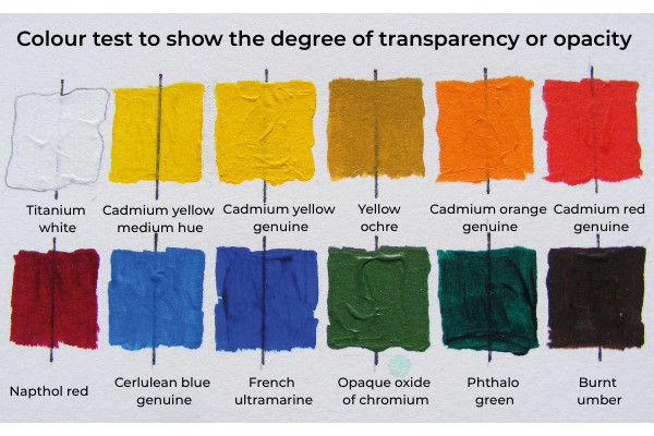
The selection of colours sent by Jackson’s contained six opaque and six transparent colours, including warm and cool versions of the primary colours.
Titanium white is highly pigmented and buttery, and will obliterate well. It's important that a white has sufficient strength to do this.
Cadmium yellow medium hue captures perfectly the mass colour of genuine cadmium, but it has none of cadmium’s opacity, being very transparent. It's probably more useful in glazing than the genuine colour, which tends to veil the under colour rather than blend to create a third colour, when applied in dilution.
Cadmium yellow genuine is punchy and works well in acrylic. Good opacity ensures that there will be no streakiness when applying a flat area of the colour.
Yellow ochre is a more opaque yellow earth than raw sienna and is always useful in any palette. It can vary in hue from greenish to brownish in character. Jackson’s version is fairly neutral and a little more opaque than some.
Cadmium orange genuine is opaque, thickly creamy, bright and buttery, and probably is best used in pure touches, and for adding in small amounts to ‘bend’ other colours.
Cadmium red genuine is a bright pillar box red with an orange bias, making bright oranges with cadmium yellow, and dull purples with blue. As with all cadmium colours, good lightfastness is guaranteed.
Why not try a selection of colours? Jackson's offer a set of four 60ml paints containing Titanium White, Cadmium Yellow Hue, Orange Red and Blue Ultramarine or a set of eight 60ml paints containing Titanium White, Lemon Yellow, Cadmium Red Hue, Alizarin Crimson Hue, Cerulean Blue Hue, Phthalo Green, Yellow Ochre and Burnt Umber.
Napthol red is a somewhat muted purplish red.
Cerulean blue genuine is strongly opaque and has a good solid texture. Cerulean makes bright greens and soft purples. Reduced with white and brushed on with a very lightly loaded brush, it can add distance to landscapes. Cerulean means sky blue and, with white, it makes a great sky colour.
French ultramarine is a brilliant semi-transparent purplish biased blue, which creates soft greens, ideal for landscapes, and vibrant purples when mixed with cool reds, such as permanent rose.
Opaque oxide of chromium really is densely opaque. It is a subtle green and mid-toned. Its use is mainly in landscape subjects, but it can be used in small amounts to ‘bend’ other colours to achieve subtlety.
Phthalo green is a slightly brighter replacement for viridian, which is incompatible with acrylic resin. It's very transparent and, unlike viridian, extraordinarily powerful. It's an unnatural green, but is a great mixer, creating a great range of gorgeous greens with yellows and earth browns. With a purplish red it also makes a great black. Its high transparency makes it an ideal glazing colour.
Burnt umber is a transparent dark brown, usually with a reddish bias. A bread-and-butter colour, it's very useful for softening or darkening harsh colours. When washed down or lightened to the palest of tints, it replicates the sand colour of a tropical beach perfectly. With ultramarine, it makes good blacks, warm or cool, depending on the amounts of the component colours.
Opacity and transparency

Expanding on the differences between opaque and transparent colours, when we look at an opaque colour, the mass tone reflected from its surface is virtually unchanged, even if it's reduced by dilution. In the eight colour strips (above) we see both opaque and transparent versions of green, blue, red and yellow. The lower strip of each of the pairs of colours is opaque. Although given a similar amount of dilution as the transparent versions, their tones remain much the same throughout their length. This is why they are so good at producing flat fields of colour.
In oil, gouache and acrylic, opaque colours are punchy and vibrant but, reduced to watercolour-type washes, they can look faded and lifeless. Their value in watercolour is to apply touches of colour over underlayers.. These being opaque and not diluted much, will sing out. Opaque colours do light over dark very well.
Looking for the perfect brush to use with your acrylics? Discover Max Hale's first impressions of Jackson's own-brand oil and acrylic brushes.
It can be difficult to distinguish between some of the darker transparent colours, because light is being absorbed by their surfaces. If we look at the top strips in each of the colour pairs, we can see that the colours come alive with dilution, and give delicacy and richness in paler tints.
The textural character of transparent pigments is a good tool in acrylic painting. Broken effects can be very useful, particularly in underpainting, and they were used extensively in the demonstration painting below.
Visit Jackson's website to discover the full range of Artist Acrylics.
Glazing
Transparent colours are very useful for applying a modifying colour over an underlayer. Known as glazing, this technique is particularly useful in acrylic, as you have none of the technical constraints found in oil painting.
The colours can be diluted with water, but often a more even effect can be achieved by rendering a colour into a paler tone with an acrylic medium; use a matt, rather than gloss medium for this. Glazes have been used in the following demonstration.


