


With its distinctive character, founded on sound technique and always showing insight and verve in its execution, Frances Bell’s work has attracted much acclaim. Frances is best known for her portraits, but equally she loves painting landscapes, and for both types of work she creates paintings of her own choice as well as undertaking commissions.
Especially with the portraits, their impact and success owes much to the classical training Frances received at the Charles Cecil Studios, Florence, where she studied for three years. ‘It is an incredible place,’ she says, ‘and it has been the dominant influence on my work. It gave me an enormous array of skills with which to develop my own style of painting.’ Having always lived in the countryside, Frances has developed a strong feeling and affinity for the landscape, and is particularly inspired by subjects that show an interesting quality of light.
Most of her landscape subjects are found in Northumberland or in the Scottish borders, where she lives. She likes the variety of dramatic skies, hills, forests, coast, moorland and so on that is found in this region. Her method is to work directly from the scene as much as possible, just adding the finishing touches in the studio. In comparison to the portrait paintings, an advantage of painting landscapes, she finds, is that they allow more freedom in the way that the subject is interpreted.

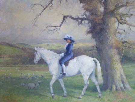
Anna, oil on linen, (167.5x127cm)
Likeness and expression
‘With a portrait,’ Frances explains, ‘the person commissioning the painting will naturally have certain expectations as to how the portrait should look – after all, they will know the sitter very well. So I try to understand those expectations and take them into account. My aim in every portrait is to paint a technically sound head at the very least. All the proportions must be correct and additionally I am seeking to capture the individual expression of the sitter. That is extremely important for me. There has to be something behind the eyes, something that people can look at and relate to.
‘Obviously I want to create a successful likeness. Essentially I paint what I see. I am not a flatterer, although having said that, if someone is terribly worried about a facial blemish of some kind, I am happy not to include it. In fact, I prefer people with unusual faces: they have more impact. And similarly for the viewer, interesting faces are usually more appealing than beautiful faces.
‘Both the portraits and the landscapes are built on the same principles as far as observation, composition and technique are concerned – in both, my chief considerations are light and shade, atmosphere, a sense of focus and a rhythm for the painting. With the portraits the composition is determined by the pose, which I want to be as natural as possible, because it will reveal something about the sitter. When I start painting I encourage the sitter to talk and to tell me something about themselves. This helps inform the painting as it develops and it helps relax the sitter so that they take up a comfortable and natural pose.’

Snowy Lane and Fox, oil on linen, (30.5x40.5cm)
Sittings
For the commissioned portraits Frances likes at least four sittings of about three hours, and quite often these take place at the sitter’s house rather than at the studio. However, when she is working on a portrait of her own choice she prefers more sittings, perhaps six or seven. And with every portrait she spends an equal amount of time working in her studio, away from the sitter. ‘The studio time,’ she says, ‘is good for thinking, planning, and a more dispassionate approach. ‘Also, I can work on the background and clothing. Occasionally I borrow items that are to be included in the painting so that I can work on these in the studio. Very occasionally I might use a photograph – of a necklace, the cuff of a dress, or a similar detail – as reference. This means that when I am with the sitter I can spend all the time concentrating on the head, features and hands.
High Sherriff of Northumberland, oil on linen, (91.5x112cm)
Shapes first
‘I start with large areas of tone,’ Frances explains. ‘So, rather than drawing an outline or working out where a feature might be by putting down a line, I loosely block in areas of tone with big brushes. I am looking at the lights and darks: these will create the building blocks from which to develop the painting. Again, this is a process that was part of my training at the Charles Cecil Studios. We were taught to “chase the shapes first”. ‘Thereafter it is a matter of analysing and adjusting as each layer is added.
Initially the paint is quite thin. As a vehicle for the paint I use a mixture of linseed oil, turpentine and Canada balsam – used very thinly with the turpentine to begin with. At first I concentrate on the head. Ideally I would like to develop the whole painting at the same pace but, given the limited number of sittings, that is not possible. So I focus on the head, and once I am happy with that I work on the rest of the body and the hands.

Tessa, charcoal, (61x51cm)
‘It is very important to capture the expression of the hands and to make them look natural, which means that sometimes you have to ‘pose’ them to an extent so that they don’t look repetitive. What you must avoid are ‘radiator hands’, in which the fingers all look the same and seem to resemble the bulbous sections of an old fashioned radiator. Instead, as your example, study the hands in Van Dyck’s portraits!’
For Frances, another crucial point is the way that she sets up her easel in relation to the sitter. The canvas is positioned at the side of the sitter, rather than in front, with the sitter raised so that their head is at eye level and level with the canvas. And she likes plenty of space behind her, so that she can walk back and view the subject from a distance.

Mending Tack, painting in progress

Mending Tack, oil on linen, (101.5x101.5cm)
All her assessments of the sitter are made from about five paces back. ‘I remember what I have seen and then return to the canvas to make the mark,’ she explains. ‘It involves a lot of walking to and fro, a technique known as sight size. I walk about two miles a day. But the fact is that oil paintings read best from a distance. If you paint from that distance not only is it so much easier to see what mistakes you have made, but equally you can judge how well the painting will look when it is eventually finished and hanging on the wall.’
Frances Bell trained in the classical tradition at the Charles Cecil Studios, Florence and has taught at the same school for the summer terms 2005 to 2011. Her work has been shown in various exhibitions, including Not The Turner Prize, 2004 and the Royal Society of Portrait Painters Annual Exhibition from 2005 to 2011, at which she won the De Laszlo Foundation Award for Portraiture in 2006. She has since been invited to become a candidate for membership of the RP. Frances regularly shows work with the Society of Women Artists, of which she is now a member. She won the Winsor & Newton Young Artist Award at the SWA annual exhibition in 2010 and The Artist Editor’s Choice Award and the Barbara Tate Award in 2011. Her first solo show was at Bonhams, Edinburgh in 2009. Frances accepts commissions in oil for landscapes and portraits, and also commissions in charcoal for portraits. For more details see www.francesbellpaintings.co.uk
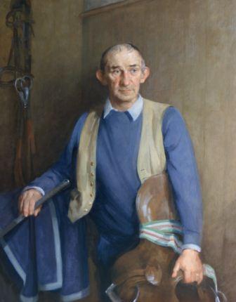
John Leadbetter, oil on linen, (112x86.5cm)
Frances Bell’s limited palette
Frances uses just four colours for the flesh tones: ivory black, vermilion, yellow ochre and lead white.
Additional colours are used as necessary for clothing and background. She says ‘Based on my training, essentially I rely on chiaroscuro (light and dark) to create form and develop the painting. Too much colour will fight with the light and dark qualities and consequently undermine the sense of focus.’ Frances paints on medium, oil-primed linen canvas prepared with a greyish ground made from a mixture of ivory black, yellow ochre and a touch of vermilion, heavily diluted with turpentine. The medium-toned ground offers a much better surface against which to judge the colour values of the painting than the white surface of the canvas, which can be very distracting.

Grandpa, photograph showing the sitter and the painting in progress. Canvas size, (45.5x51cm)

")


Comments
Login or register to add a comment
No comments