


When sketching in the city, it is helpful to arrange all the tools you need (sharpeners, coloured pencils or paintbrush and paints) within easy reach, so you don‘t have to constantly rummage through your bag while you work. Beginners just need a pencil and one or two coloured pencils to brighten up sketches.
Materials for urban sketching:
- To start with, I recommend that you obtain a set of pencils in grades 2B, 3B and 6B. Make sure that these have high quality leads that will not constantly break off while being sharpened. A propelling pencil with the same grades of lead will also be perfectly serviceable, but make sure that the lead sleeves vary to match the diameters of the different leads. In other words, for a thick 6B lead, you will also need the corresponding lead sleeve.
- If you are drawing in ink or Indian ink, all you will need is a fountain pen. This can be fitted with black, blue, brown or red ink cartridges, depending on your subject.
- Although pencils and fountain pens are the most commonly used tools for urban sketching, it can also be exciting to try out other drawing implements such as ballpoint or rollerball pens.
- When it comes to colour, I recommend having a few good pencils ready, preferably in ochre, red, light blue, cobalt blue, yellow and olive green – and white too if you are using toned paper. If you prefer to paint, a simple set of watercolour or gouache paints will do for the time being.
- Your choice of paper will depend on what you are drawing with. Thin paper is suitable for pen or pencil sketching, while thicker paper will also allow you to work with a paintbrush and watercolours. Either way, I recommend smooth paper. Rough, coarse-grained paper is often recommended for watercolours, but its surface makes it harder to create quick, spontaneous lines with your pencil or fountain pen.
- Whether you choose to use a notepad, a sketchbook or loose sheets of paper resting on a hard surface will depend on which of these options you are most comfortable with. Take the time to try out all the different options. Loose sheets can also be fi led and stored in a loose-leaf binder, the sturdy plastic cover of which can also serve as a hard surface to draw on. The advantage of this is that it leaves you free to choose any kind of paper you like. For example, square-ruled sheets offer clear vertical and horizontal lines which can prove very useful when drawing certain motifs, while toned (preferably brown) paper is ideal if you are working with white. When drawing outdoors, it is advisable to begin on A4 or A3 sheets of paper. On the other hand, small A5 sheets are often useful for rapid sketches in more confined spaces, such as on the bus or train.
- A stable drawing surface is particularly important when sketching outdoors. Sketchpads, clipboards or the rigid plastic cover of a binder are all useful if you are working in the open air – but make sure that you can work without obstructions or interruptions. Nothing is more tiresome than your paper constantly flapping in the wind, or having to rest it uncomfortably on your knees.
- Beyond that, you should always have a sharpener, an eraser and a small bottle of water to hand. The best place to store all this equipment is in a messenger bag. If you are practically minded, you could even acquire a small, lightweight folding stool – and think about weather-appropriate clothing too!
Shading and textures
It is not always easy to reproduce what we perceive around us in the form of a vivid sketch on a restricted, two-dimensional paper surface. We must therefore use a repertoire of graphical techniques not only to skilfully depict the correct shape of the subject, but also to achieve a sculptural yet painterly effect by creating an illusion of light and shadow. If using colour, we can achieve this three-dimensional, spatial effect through tonal gradation; however, when sketching, we chiefly rely on hatching, textures and, in some cases, shading and blending in order to add a dark tonal value to certain parts of our picture.
When hatching, make sure you fill the entirety of the surface you are working on. Draw parallel lines as far as possible, rather than simply scribbling over the surface. The easiest option is usually to add vertical hatching; however, this tends to obscure any doors or windows you may have previously drawn on the walls of buildings. Remember to leave sufficient white space when applying dense hatching!
Diagonal lines will leave such details visible. Nonetheless, it is possible to apply hatching in different directions in order to achieve highly targeted effects.
Exercise
Make a few small sketches to test out the effects of different graphical patterns and tonal values. Switch between pencil and fountain pen, and use coloured pencils too, in order to gain practice with different drawing implements. Make sure you also try out shading and blending using your pencil or eraser. Shading involves running a soft, blunt pencil back and forth gently and evenly in different directions until the surface is completely covered. This achieves a consistent tonal value. Careful blending using your finger or eraser can also soften the transitions between different tones.

View of a subsidiary channel of the Grand Canal, Venice. (3B pencil, fountain pen and ink; sketchbook with white paper.)
Demonstration: Row of houses in Camden, London
When drawing this short row of houses and the prominent round building at the end, I focused chiefly on achieving the right perspective. The vanishing point which the lines recede towards is on the left-hand side of the page, and the horizon line is in the lower third of the picture. The latter represents the dividing line between the rising and falling lines, and you can see it at eye level in every part of the picture. This tells you the level from which I perceived the scene. The individual buildings were marked out with vertical lines and foreshortened in specific sections of the picture, while the heads of each of the passers-by are generally level with the horizon line.
This sketch was deliberately left blank in many places – partly to reflect the bright, late-morning sunshine, but also to further emphasize the two most prominent buildings. With this sort of scene, it is almost essential to add people in order to achieve a lively effect and to give the buildings a sense of scale.
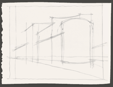
The street in focus was set out in a preliminary sketch using fine lines and single-point perspective.

Some initial figures and the outlines of the buildings were added in ink.

The rest of the people were added, all of whom are positioned just below the horizon line. The houses were given more character by drawing openings and structural features.

Hatching was added to depict shadowed areas on the buildings; the remaining sides were left blank to suggest illumination from the sun. Some of the windows stand out as patches of black.

Fountain pen and black ink; sketchbook with lightly toned paper.
Demonstration: Street corner in Mysore, South India
A dissonant corner building in the heart of Mysore’s market quarter, made harmonious and beautiful by the diverse shapes and colours of its individual parts. Gabled projections, vibrant awnings, advertising posters, intricate interplays of shape and form, curtains and ground-floor shop displays all serve to decorate the façade, while a constant stream of traders, cars and scooters flows past. All in all, it is hard to imagine a livelier scene. It is essential to use colour for a scene like this; yet you will also need to use your pencil occasionally to add a spectrum of lighter and darker grey tones in order to place accents and points of tranquillity amid the array of different colours. After drawing a quick and broadly harmonious preliminary sketch, I added paint in an almost spontaneous, free-flowing manner, using my pencil intermittently to adjust individual elements of the picture with a view to managing the overall effect. Complementary colours, such as yellow and blue, or red with a little green, add colour contrasts that I softened occasionally using the lead of my pencil.


")
")
")


Comments
Login or register to add a comment
No comments