


Recently, while painting en plein air, a spectator watched me for a few minutes before commenting that the colours I was using weren’t anything like the colours in the scene before us. She seemed troubled by this. I tried to reassure her that while she was correct, I wasn’t using colours that would create an exact representation or even combining primary colours in a typical fashion to create expected results, and that there was a method to my madness.
I told her to wait and see what happened. She looked at the painting sceptically; I could tell she thought the painting was ruined after watching me lay down a colour that was seemingly incongruent to the scene, but by this point she was curious enough to see where it would go. She stayed and watched, both wary and interested.
When I first began painting I tried to capture scenes and colours the way my eyes took them in. The reality was, of course, that at any given moment, the light might change and, with it, the colour would take on a different hue or tone or perhaps change to an altogether different family. Colour is varied and unpredictable and the combinations that make up the physical world are in the thousands. I tried to paint greens by combining blues and yellows, and purples by combining blues and reds, as most beginners do. Yet, here I was with my incredulous friend, not only eschewing typical primary colour mixes, but also using colours that, to our conditioned way of thinking, don’t even make sense.
Unpredictable
Colour is unpredictable and difficult to replicate; by making colour choices that move from the expected to the unexpected the artist can create a mood or begin a story in an entirely different way. When a viewer sees the unexpected colour it garners attention and causes a moment of recalibration; often a captivating story takes hold, moving the viewer in ways predictable colour choices might not.
My spectator friend stuck with me as I completed the alla-prima painting and, as I added the finishing touches and flourishes, her expression softened and she began to exclaim at how the colours were jumping out to her and capturing her imagination. I smiled inwardly and asked her to tell me the story she saw in the painting. By now she had forgotten that the colours weren’t the same ones she saw in the scene before us. What mattered wasn’t the colour, but the story the colour allowed the painting to tell.
My students will often default to trying to match the local colour in the reference photo or the scene in front of them. Perhaps we are unwittingly taught to think representational art requires nearly exact replication, or unusual colour choices will cause too much sensory disruption. In fact, by using colours not typically present in a particular scene or by choosing different, and out-of-the-ordinary colours, we can create compelling paintings that draw the viewer in, create a mood, and make an individual statement. In any classroom situation, I ask my students to trust the process described here and explore varied colour choices. Most often they finish the class delighted with the results.
The process
Before beginning a painting, I evaluate the scene before me and make decisions that establish how to start a story – my goal is never to complete that story but allow the viewer to finish it. How will different compositions and formats capture the elements and create the story? What happens if I choose an elongated landscape format over a square or rectangular one?
Once I have established the format, I move on to my colour choices. I begin by establishing which colour stands out in the actual scene. I call this the ‘star’ colour. Next, I consider how changing the ‘star’ colour will influence the mood of the painting. For example, if yellow is the ‘star’ colour, what will happen if I change it to opera pink? Knowing opera pink will have a strong presence, my next step is to determine which colours in my paintbox can take supporting roles, allowing the star colour to shine without being overwhelming. I do this by choosing complementary colours to create dyads or triads that wouldn’t necessarily be found in the natural setting, but that draw the viewer in with interesting elements.

FIGURE 1
A combination of opera pink, phthalo turquoise and burnt umber was used to create this dynamic landscape
In this type of exercise it is important to choose harmonious colours as the goal is to move the viewer to see something new and fresh rather than overwhelming them with complexity. As you can see in Figure 1 (above), if I combine opera pink with phthalo turquoise and burnt umber, I can use the turquoise as a foil to push the pink out to the viewer and create an exciting and unusual landscape. The brown tone in the foreground is a mix of burnt umber and opera pink; I varied the shades by layering the colours on top of each other, weaving them in and out. The entire painting was done using only three colours.

FIGURE 2
This landscape was painted using carmine red, phthalo turquoise and burnt umber
Now look at Figure 2 (above). If I choose carmine red as my star colour, combining it with phthalo turquoise and burnt umber to form a triad, I am able to create the subtle green shade found in the forested area to the left. Moving horizontally right, from the centre of interest, the individual colours transition to blended colours, adding movement.
Experiment
Remember that trees aren’t always shades of green, water isn’t always shades of blue, and sunlight isn’t always shades of yellow. There is a vast spectrum of colour in the natural world and all it takes is a little courage and creativity to explore how those colours combine on paper or canvas to start an entirely different story.
Much like my spectator, most painters consider using opera pink only when painting flowers and don’t imagine it as part of a natural forest scene. With some experimentation, however, its unconventional use can open up a whole new landscape giving us new eyes, new stories, and new adventures.
EXERCISE
Using atypical colour dyads and triads takes practice and plenty of experimentation. One exercise that I frequently employ is something I call ‘Gifts From the Moment’, which allows me to warm up, free my mind and body, and explore the colour combinations to see what will happen. Again, I don’t just choose random colours, I choose one ‘star’ colour and then pick complementary colours to support it. Sometimes I get serendipitous results that become small paintings on their own, but I generally just use the exercise as a gateway to develop my next steps in creating a larger painting. I start by taping off a ¼ sheet of 140lb (300gsm) Arches watercolour paper into quadrants. I then explore themes, painting quickly and easily using only two- or three-colour combinations.

I started with traditional landscape blues and yellows
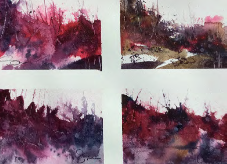
I pushed the combinations using less traditional colours
Try your own ‘Gifts From the Moment’ exercise by taping off a sheet of watercolour paper and begin by painting freely. Notice where the colours blend and how they play off one another. Try mixing with varying amounts of colour and thickness.
DEMONSTRATION Quiet Moment
The following example walks through an entire painting progression using a dyad of lunar blue and bloodstone genuine. Note that carmine red is introduced only as a dramatic element to enhance the face of the figure on the boat but doesn’t constitute a triadic element as it is not used and mixed throughout the painting.
Because this is a waterscape, it is not at all unusual to use blue as the ‘star’ colour. Traditional colour choices would include cerulean blue, cobalt, or ultramarine but I chose lunar blue with its greyed tones, in order to create a mood and set the stage for a visually interesting story. The limited use of colour allows for a unified but dramatic painting.


")


Comments
Login or register to add a comment
No comments