


People are often surprised when I suggest that they’re struggling to achieve the result they require because they’re using the wrong materials for the purpose. For example, they may be unaware that some colours behave differently from others, or that the choice of papers can influence results.
I use Saunders Waterford rag paper (‘rag’ is made from cotton, rather than wood fibre) for my paintings. The high white version (whiter than traditional white) gives me the extra brightness I need because I don’t use white paint; my white is simply the paper. The numerous layers I often paint mean that the paper needs to be durable.
I use a dozen colours – Winsor lemon, Winsor yellow, permanent rose, scarlet lake, French ultramarine and Winsor blue (green shade), raw sienna, burnt umber, burnt sienna, quinacridone gold, Prussian blue and cobalt blue – and know how they behave on my paper. Knowing which mixes give bright colours and which give subdued colours will save a lot of disappointment. I often combine French ultramarine with burnt umber to produce an interesting natural grey mix; these colours work well for me for rocks, clouds or water. Mixing two colours rather than buying a ready-mixed uniform grey means that I’m able to have a variety of shades of blue-brown
in the warm and cool greys that form, rather than simply different tones of the same colour.
The following shows you how to play with your materials – and have fun while you paint! It isn’t difficult to learn how your materials handle and experimenting can be very enjoyable; write down what you did in your notebook: the colours (including manufacturer and quality); the techniques; the paper... what happened? Try the same method with different colours, or a different method with the same colours.
Besides your tools, you’ll need to develop two more things for success: drawing skills and observational skills. To make progress as an artist you will need drawing skills. For the latter, you’ll get more out of everyday life if you learn to really look at, and take note of, what
is around you; you’ll find there’s a lot more to it than a cursory glance reveals.
Technique: Preparing your paint
The clue is in the name but isn’t explained on the packaging; watercolour paint should be mixed (diluted) with water; it should flow when mixed and not need to be physically spread as you would when applying emulsion paint.
Watercolours become paler as they dry so when preparing your paints, you need to make your colours/tones stronger to begin with to allow for this.

1. Squeeze out a small amount of paint into a space on your palette. Wet a No. 10 Round brush and add water by gently brushing the brush over the paint.

2. Continue until the mix forms a drop which drips off your brush when held up like this.
Brushstrokes
Before buying a large number of brushes, I recommend that you get to know what you can achieve with a single, good-quality No. 10 Round brush. The doodles I’ve suggested here resulted from a challenge that I set myself many years ago, which was to achieve effects with a single brush that are often thought to require numerous specialist brushes.
Half an hour of playing with a brush is useful to find out what can be achieved and is a relaxing introduction to watercolour. Improving your brush-handling skills will certainly not be wasted time.
USING YOUR BRUSH
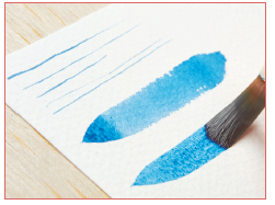
Prepare some well-diluted paint and place your paper on a board. Using just your No. 10 Round brush, try to make all the strokes shown below. The most important marks (A-E) are explained in more detail on the opposite page, but experiment to see whether you can create the other marks (the ‘Other marks’ box, below right, provides some starting points): A Fine lines; B Broad lines; C Very broad lines; D Tapering strokes; E Drybrush; F Gentle jabs; G Broken lines; H Grasses; I Flower; J Dots, swirls and squiggles.

BRUSH TECHNIQUES
These five simple marks are hugely versatile, so taking the time to practise them will give you confidence for the paintings to come.

(A) Fine lines
For fine lines you shouldn’t have too much paint on your brush because a fully loaded brush (that is, about to drip) doesn’t form a fine point. First dampen your brush and check that it makes a good point when twirled on kitchen paper/palette or rolled between your finger and thumb. Hold the brush upright and lightly draw the brush across the surface of the paper. Practise adjusting your lightness of touch, and the amount of paint in the brush, until you get the finest lines possible with that brush.
(B) Broad lines
For broad lines, load your brush (dip and pick up plenty of the paint). Holding the brush upright, press down gently so that the hairs point left (reverse if left-handed) and sweep the brush sideways across the paper, pressing down to get the full width of the brush.

(C) Very broad lines
For a very broad line, load your brush, press it down onto the paper with the hairs facing away from you, and move it sideways to get a stroke that is the length of the hairs. Your brush will soon run out of paint and will then give a broken line – this is used for the drybrush technique (below).

(D) Tapering strokes
Useful for ripples or willowy marks. Load your brush then wipe it on your palette to remove a little paint (we want a fine point to begin the stroke). Hold your brush upright, moving sideways before you touch the paper, and touch down lightly. Then, still moving, increase the pressure to get a wider stroke. Finally, gently release the pressure (still moving across the paper) and lift off. When done well, this stroke has a lovely rhythmical feel.

(E) Drybrush
Giving a broken line effect, suitable for sparkle on the sea, for example, drybrush is a versatile technique. Make a broad sideways mark with a brush that has little paint in it, in other words the paint has begun to run out. If you have difficulty with this technique, you may find it helps to hold the brush flat, as if you’re about to roll it across the table, and gently skim across the paper. Your paper needs to be held flat.
Other marks
What mark does your brush make if jabbed gently at the paper? This brush gave me a rough leaf shape (below). Try rotating your brush in your fingers to see if you get the same pattern if you turn it.

Try with varying amounts of paint and pressure. Dots, swirls and squiggles (below) are most easily made with the brush held upright.

BRUSH CARE
- Never put a dry brush into paint; always dampen it first.
- Wash your brush thoroughly after use, in cold water. Use your fingers to reshape it to a point then leave to dry. Once dry, I store my brushes in a pot with the tips upright so that the hairs will not get spoiled.
- Never leave your brush standing on its tip, whether in water or not. The tip will be spoiled and it is very unlikely that you will be able to straighten it.
Washes
Being able to create a good wash is a basic watercolour skill. A wash is simply an area of paper covered with diluted paint. For best results, do this simply and directly, using plenty of the diluted paint. The result should be free of streaks and almost ‘glow’ as the paper shows through a thin wash.
Good paper is essential for a successful wash; cheap papers may cockle or disintegrate. You can, however, practise multiple washes on one sheet of good paper, by allowing each to dry thoroughly before applying the next.
A wash should only be worked into or added to while it is still damp enough to shine. If you add paint once the shine subsides, the effect is similar to when a drop of water falls from your brush onto your damp painting; you will get a blotchy watermark or ‘backrun’. This occurs because the paper has already absorbed some of the water from the first wash. A common beginner’s mistake is to fuss too much. If, for instance, you notice a small fleck of paper unpainted, the temptation is to go back and paint it, but you may create a backrun where the new paint displaces the paint in the first wash. Leave it to dry before doing anything.
Preparing a wash
When preparing a wash, put water into the palette and add colour to it until you have the correct strength of colour. Experiment with clean water to find the amount you need to wet your sheet of paper. You can then allow the paper to dry and reuse it, knowing how
much water you’ll need for a wash.
When you begin to work on larger paintings you may be surprised at just how much paint you’ll need for a full page. Try half a teaspoon of water as a starting point for a 4x6in. (10x15cm) size of painting. Remember that the brush will take up quite a lot of paint, and allow for that.
Technique: Flat wash
A flat wash is a basic wash that will help you understand the importance of having plenty of paint prepared, applying it generously and leaving it to dry. The colour and tone of the paint should be the same throughout the wash. Don’t wash the brush in between strokes,
as this will dilute your paint.
Before you begin, secure your paper to a board, and set it at a slight slope in order to help the paint flow. Mix a little more paint than you think you’ll need.
Holding the brush upright as you paint each stroke allows the paint to almost fall from the brush. If your brush starts to run out of paint before you get to the other side of the paper, quickly dip again and continue; try to use a large enough brush so that this doesn’t happen.
Don’t worry about the little pool or bead of paint that forms at the lower edge of the wash; this prevents the paint from drying too quickly and allows the next stroke to blend smoothly into it.

1. Starting from the top of your paper, load your brush with paint dilute enough to form a drop at the brush tip. Draw it in a broad stroke from left to right (right to left if you’re left-handed).

2. Lift the brush away, then make another stroke from left to right, overlapping the previous, still wet, one. This helps to avoid streaks.

3. When you have painted as much as you wish to paint, dab your brush on kitchen paper to remove excess moisture and create a thirsty brush; use the tip of the brush to ‘drink’ any colour that is pooling at the edge. Don’t press too hard or you may create a pale area in your work.
Exercise 1 Simple landscape
Although the ability to produce a flat wash is a desirable skill, the graduated wash will be more commonly used in a landscape painting, as skies and landscapes vary in tone and colour. Tone is the lightness or darkness of a colour. A sky will normally (but not always) be paler at the horizon, as will land, so your stronger tones and colours will normally be at the top and bottom of your painting. You can dilute the paint as you go or prepare different dilutions in your palette and use paler/weaker ones as you work down the paper.
The method for applying paint to paper is the same as for a flat wash. For land you could rotate your paper 180 degrees (so that it is upside-down) so that you can still work dark to light. Unless sky and land are to merge together you’d let the sky dry before painting the land. You can also paint a graduated wash that changes in colour and tone by gradually introducing the second colour into the mix, and variegated washes where several colours are used.

1. Start the graduated wash with a broad stroke of Prussian blue. While wet, quickly rinse your brush then load it with permanent rose for the second stroke.

2. Work down to the bottom of the paper, as for a flat wash. Allow to dry thoroughly.

3. Use Prussian blue to paint a simple wiggly line as a mountain range then fill in down to a flat line (the horizon). This is effectively an area of flat wash laid over the top of the previous wash.

4. Use the point of your brush to add some lines as ripples in the water to finish your first mountain landscape.

The above information is taken from Lesley's book, Ready to Paint in 30 Minutes - Mountain Scenes in Watercolour, published by Search Press.

Click here to purchase your copy.

")
")


Comments
Login or register to add a comment