


'Summer on the Isle of Wight epitomises everything traditional and good about enjoying yourself in the countryside or on the open water,' says Becky Samuelson. 'Activity increases everywhere and the painter has no shortage of subject matter for inspiration. If only the summer months were longer!
Using acrylics
Acrylic is a forgiving and versatile medium. It can be used on many surfaces with brushes, palette knives, and even fingers, but there are a few things to remember before you start using it: it is permanent once dry; largely opaque as you mix with white (although, interestingly, pigments can be used thinly so a glaze can be achieved); it dries quickly and can be over-painted.
You also don’t need a huge amount of kit to get started and, although I favour Golden and Liquitex paints, you can achieve really good results from any introductory set.
I like to use a stay-wet palette, which is a lidded container, to keep my paints wet over time.
I have enjoyed using Fisher 400 paper for acrylic painting for a number of years. I like its tooth and the way it accepts the paint. I also find that flat brushes are good for mark making, adding character and preventing any fiddly brushstrokes!
Race Day on the Isle of Wight
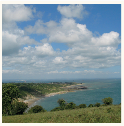
Reference photo

View over East Wight on Around the Island Race Day, Golden Fluid acrylics on primed mountboard, (20x20cm)
View over East Wight on Around the Island Race Day (above) depicts the view from the Downs above Whitecliff Bay towards the headland of East Wight. It’s a prime spot to watch the Around the Island Race and this painting shows the little white sails in the far distance.
I primed mountboard with gesso and an orange colour before I began, intending from the beginning to allow some of the orange ground to show through in the finished painting. This meant I had to keep my brushstrokes open and not overwork them.
Square or flat brushes are good for this technique. You have to be prepared to throw caution to the wind, however, especially if you are naturally a fiddly painter.
One of the great advantages of acrylic paint is the way the properties vary depending on the type of acrylic you use.
Golden fluid and heavy body acrylics
I love using Golden Fluid in particular. It was developed to provide the artist with a runnier consistency while not compromising on the saturation of the pigment. So very little water was required to use with the paints for this picture, and I loved the way the fluid colours slid across the surface.
Golden Fluid is quite different to heavy-body acrylic. All the paints need to be squeezed out in a stay-wet palette so I could go from one to another quickly to keep the speed and continuity going. This way I facilitated the transition from one colour to another and the optical mixing of the colours on the surface of the board.
Golden Fluid can also be used in a semi-glazing technique. I do this after I have laid down a colour, for example, the blues in the sky. Once dry, I go over it with a thinner application of paint, in this instance white and phthalo blue, which allowed the underlying paint to show through. I also used very small amounts of black, to temper the brightness of some of the colours.
Be careful not to use too much black though; it can overwhelm a scene easily.
Demonstration: Scows Racing

Reference photo
Step 1

1. Cool colours are used to help with creating distance in a painting, while warmer colours appear to come forward. For the sky, try using cooler cerulean blue against the slightly warmer, but nonetheless cool, cobalt blue together with white for the clouds. Use the pigment fairly neat with just enough water to apply it; the colours should be strong and pleasing to use.
2. The square brush is good for cutting in around the tops of the boats. Make sky greys by adding just a touch of red oxide and white to temper the blue and reduce the brightness. The paint is fast drying, which allows for immediate overpainting.
3. Block in the sea with a mix of cerulean blue, raw umber and white and pick up any remaining sky colours to vary the colour. Try to avoid adding detail and remember at this stage you are not aiming to complete an area. It’s best to cover the whole surface with paint then contemplate balancing colour and developing tone.
Step 2

1. Block in the sail colour. Again don’t include detail but think about how the tones and shapes will develop. It takes courage sometimes to keep it uncomplicated, but detail comes later! Mix the hull colours from earthy oxides, umbers and brighter blues.
2. Sweep some more of the sea colours across the foreground. This builds up tones and gives body to the painting. Try not to fiddle and paint everything you see; keep the brushstrokes confident. If in doubt, practise this first by applying some fast strokes on a spare bit of paper with a ¾in or 1in. brush. You’re aiming for a general and characterful feeling rather than a detailed approach.
Step 3
1. Assess all parts of the painting. Begin with the sails, repeating the colours, tidying up the edges and adding shadow with bluer paint. Put the rigging in lightly so it doesn’t dominate the picture, and add the figures. Don’t forget that colours change according to the light; red will look bluer in shadow, for instance, and more orange in sunlight. It’s easy to make corrections in acrylic so allow yourself to be unrestrained and play with colours and looser strokes. If you get lost at any time, don’t be afraid to go back in with your pastel pencil to clarify what you are doing.
2. Next check the sky; I added small clouds around the top of the sails. Anchor the boats in the water by darkening under them with cerulean blue, raw umber and a little lemon yellow. If necessary, keep a softening brush handy to assist with the blending.
3. Finally, look for reflected colour from the sails in the water.
The finished painting

Scows Racing, heavy-body acrylic on Fisher 400 paper, (25.5x30.5cm)
Painting against the clock

Reference photo
I enjoy setting different goals for myself. View over Freshwater Bay from Tennyson Down (below) was completed within a time limit of half an hour.
This is great for stopping ourselves from fiddling! As you can imagine everything has to be done at top speed; there’s no thinking time and it’s quite nerve wracking, or is it?
Putting a clock on myself – and my students – forces everyone to focus. It stops fussing or over-thinking and encourages everyone to work with fast, liberating painterly marks. It’s worth a try!

View over Freshwater Bay from Tennyson Down, acrylic on Fisher 400 paper, (10x32cm)
I used two System 3 flat brushes sizes ¾in. and ¼in. and, in the spirit of keeping to the allotted time, I completed it.
The limited choice of colours unifies the painting; it’s always a good idea to work with as few a selection of colours as you can get away with.
For this painting I used: raw umber, Hansa yellow, phthalo blue, quinacridone magenta, burnt sienna and white – and painted on Fisher 400 paper. Yes, there is more I could have done and changes I would make if I painted it a second time, but I’m happy with the ‘openness’ of the piece.
Becky Samuelson
Further information on Becky, her paintings and tuition can be found at www.beckysamuelsonfinearts.co.uk
This feature is taken from the August 2014 issue of Leisure Painter


Comments
Login or register to add a comment
No comments